Plotting partial pooling in mixed-effects models
In this post, I demonstrate a few techniques for plotting information from a relatively simple mixed-effects model fit in R. These plots can help us develop intuitions about what these models are doing and what “partial pooling” means.
The sleepstudy dataset
For these examples, I’m going to use the
sleepstudy dataset from the lme4 package. The
outcome measure is reaction time, the predictor measure is days of sleep
deprivation, and these measurements are nested within participants—we
have 10 observations per participant. I am also going to add two fake
participants with incomplete data to illustrate partial pooling.
library(lme4)
#> Loading required package: Matrix
library(dplyr)
library(tibble)

# Convert to tibble for better printing. Convert factors to strings
sleepstudy <- sleepstudy %>%
  as_tibble() %>%
  mutate(Subject = as.character(Subject))

# Add two fake participants
df_sleep <- bind_rows(
  sleepstudy,
  tibble(Reaction = c(286, 288), Days = 0:1, Subject = "374"),
  tibble(Reaction = 245, Days = 0, Subject = "373"))

df_sleep
#> # A tibble: 183 × 3
#>    Reaction  Days Subject
#>       <dbl> <dbl> <chr>
#>  1     250.     0 308
#>  2     259.     1 308
#>  3     251.     2 308
#>  4     321.     3 308
#>  5     357.     4 308
#>  6     415.     5 308
#>  7     382.     6 308
#>  8     290.     7 308
#>  9     431.     8 308
#> 10     466.     9 308
#> # … with 173 more rows
We can visualize all the data in ggplot2 by using
facet_wrap() to create subplots for each
participant and stat_smooth() to create a
regression line in each subplot.
library(ggplot2)

xlab <- "Days of sleep deprivation"
ylab <- "Average reaction time (ms)"

ggplot(df_sleep) +
  aes(x = Days, y = Reaction) +
  stat_smooth(method = "lm", se = FALSE) +
  # Put the points on top of lines
  geom_point() +
  facet_wrap("Subject") +
  labs(x = xlab, y = ylab) +
  # We also need to help the x-axis, so it doesn't
  # create gridlines/ticks on 2.5 days
  scale_x_continuous(breaks = 0:4 * 2)
#> `geom_smooth()` using formula 'y ~ x'
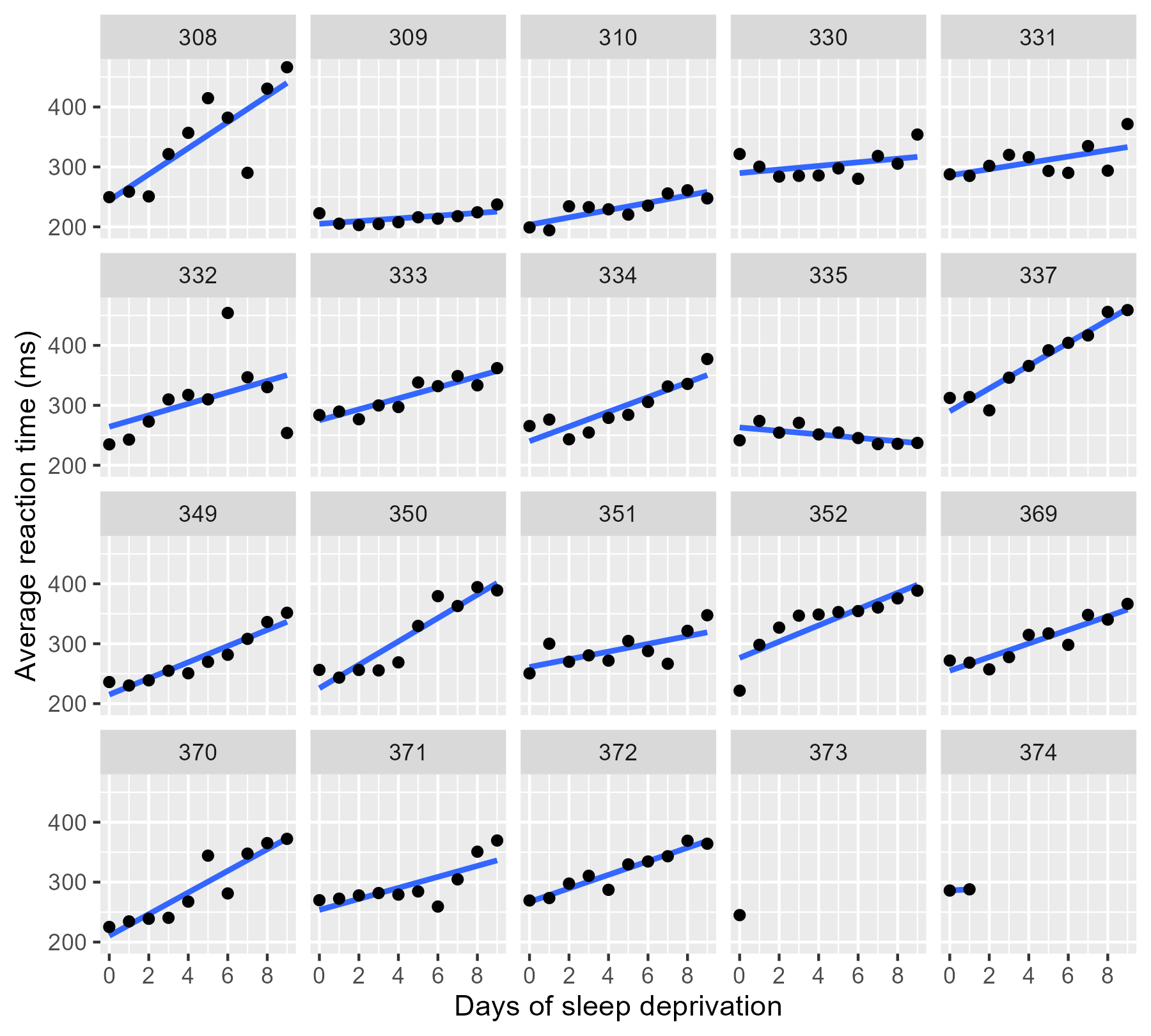
By the way, ggplot2 doesn’t draw the regression lines outside of the
range of the data unless we set fullrange = TRUE. That’s a helpful
feature for 374!
Update: Douglas Bates did it first. Someone sent me a link to a
slide deck by Douglas
Bates,
lead author of the lme4 package, where he has some plots just like the
ones I demo in this post. He uses the sleepstudy dataset too—it’s
his R package and his teaching dataset, after all—so the similarities
are uncanny but accidental. Origin of this post: I was asked on
twitter
how to make a facet plot of a mixed effects model, wrote up a quick
demo using the
convenient sleepstudy dataset, and then fleshed that demo into a
tutorial. By using his teaching dataset to illustrate some partial
pooling concepts, I ended up recreating some of his work on accident.
😬 [Sept. 14, 2017]
Complete pooling and no pooling models
Each one of these panels plotted above shows an independently estimated regression line. This approach to fitting a separate line for each participant is sometimes called the no pooling model because none of the information from different participants is combined or pooled together.
We fit a separate line for each cluster of data, unaware that any of the
other participants exist. The lmList() function in
lme4 automates this process.
df_no_pooling <- lmList(Reaction ~ Days | Subject, df_sleep) %>%
  coef() %>%
  # Subject IDs are stored as row-names. Make them an explicit column
  rownames_to_column("Subject") %>%
  rename(Intercept = `(Intercept)`, Slope_Days = Days) %>%
  add_column(Model = "No pooling") %>%
  # Remove the participant who only had one data-point
  filter(Subject != "373")

head(df_no_pooling)
#>   Subject Intercept Slope_Days      Model
#> 1     308  244.1927  21.764702 No pooling
#> 2     309  205.0549   2.261785 No pooling
#> 3     310  203.4842   6.114899 No pooling
#> 4     330  289.6851   3.008073 No pooling
#> 5     331  285.7390   5.266019 No pooling
#> 6     332  264.2516   9.566768 No pooling
In contrast, we might consider a complete pooling model where all the information from the participants is combined together. We fit a single line for the combined data set, unaware that the data came from different participants.
# Fit a model on all the data pooled together
m_pooled <- lm(Reaction ~ Days, df_sleep)

# Repeat the intercept and slope terms for each participant
df_pooled <- tibble(
  Model = "Complete pooling",
  Subject = unique(df_sleep$Subject),
  Intercept = coef(m_pooled)[1],
  Slope_Days = coef(m_pooled)[2]
)

head(df_pooled)
#> # A tibble: 6 × 4
#>   Model            Subject Intercept Slope_Days
#>   <chr>            <chr>       <dbl>      <dbl>
#> 1 Complete pooling 308          252.       10.3
#> 2 Complete pooling 309          252.       10.3
#> 3 Complete pooling 310          252.       10.3
#> 4 Complete pooling 330          252.       10.3
#> 5 Complete pooling 331          252.       10.3
#> 6 Complete pooling 332          252.       10.3
We can compare these two approaches. Instead of calculating the
regression lines with stat_smooth(), we can use
geom_abline() to draw the lines from our dataframe
of intercept and slope parameters.
# Join the raw data so we can use plot the points and the lines.
df_models <- bind_rows(df_pooled, df_no_pooling) %>%
  left_join(df_sleep, by = "Subject")

p_model_comparison <- ggplot(df_models) +
  aes(x = Days, y = Reaction) +
  # Set the color mapping in this layer so the points don't get a color
  geom_abline(
    aes(intercept = Intercept, slope = Slope_Days, color = Model),
    size = .75
  ) +
  geom_point() +
  facet_wrap("Subject") +
  labs(x = xlab, y = ylab) +
  scale_x_continuous(breaks = 0:4 * 2) +
  # Fix the color palette
  scale_color_brewer(palette = "Dark2") +
  theme(legend.position = "top", legend.justification = "left")

p_model_comparison
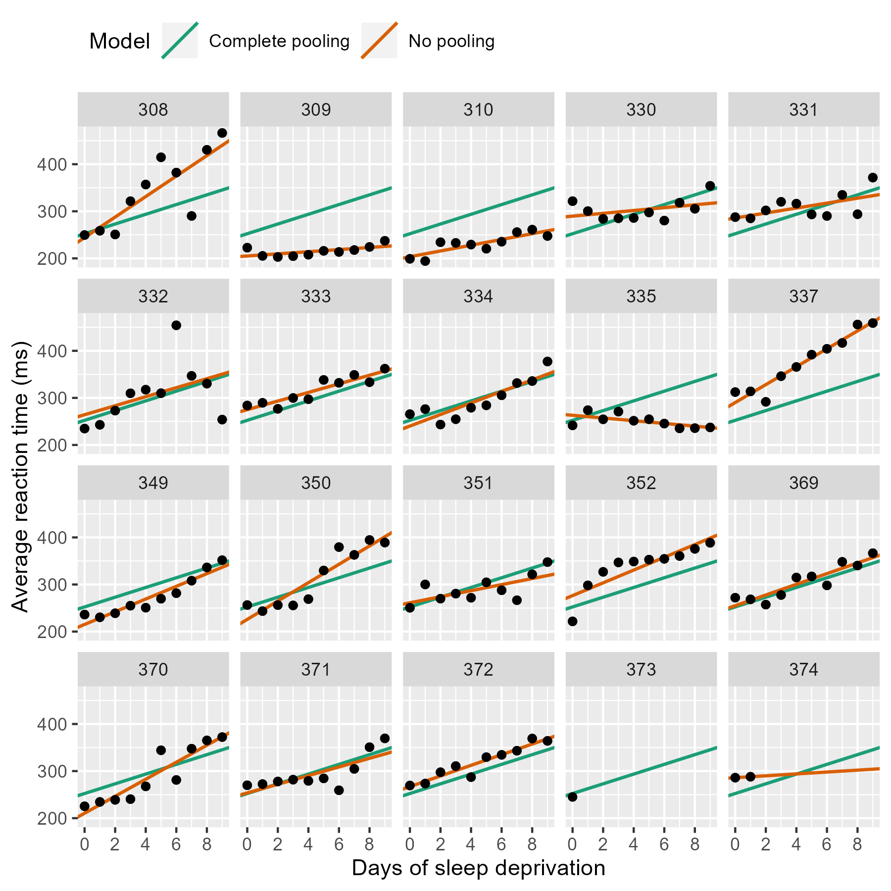
If we stare at this plot, a few things become apparent. The complete pooling model estimates a single line, and we see that same line drawn on every facet. One advantage is that the model can make a guess about the line for 373 who only has one observation. That model looks pretty terrible elsewhere—309, 310, etc.—because nobody is perfectly average. In contrast, the no pooling model can follow the data, fitting the sharp trend upwards in 308 and even capturing the negative slope in 335.
(Here’s a fun question: Which approach has the better guess for 374’s line?)
The no pooling model cannot make a guess about 373. In Statistical Rethinking, McElreath says these models have amnesia 😯:
Many statistical models also have anterograde amnesia. As the models move from one cluster—individual, group, location—in the data to another, estimating parameters for each cluster, they forget everything about the previous clusters. They behave this way, because the assumptions force them to. Any of the models from previous chapters that used dummy variables to handle categories are programmed for amnesia. These models implicitly assume that nothing learned about any one category informs estimates for the other categories—the parameters are independent of one another and learn from completely separate portions of the data. This would be like forgetting you had ever been in a café, each time you go to a new café. Cafés do differ, but they are also alike.
Once the no pooling model draws the line for 372, and it completely forgets everything it has seen and moves on to 373. It has to skip 373 because it cannot estimate a line from a single point, and it moves on.
Improving estimates with a mixed-effects model
We can do better with mixed-effects models. In these models, we pool information from all the lines together to improve our estimates of each individual line. This approach is sometimes called partial pooling. In particular, after seeing the 18 trend lines for the participants with complete data, we can make an informed guess about the trend lines for the two participants with incomplete data.
We can fit a classical mixed-effects model with the lme4 package:
m <- lmer(Reaction ~ 1 + Days + (1 + Days | Subject), df_sleep)
arm::display(m)
#> lmer(formula = Reaction ~ 1 + Days + (1 + Days | Subject), data = df_sleep)
#>             coef.est coef.se
#> (Intercept) 252.54     6.43
#> Days         10.45     1.54
#>
#> Error terms:
#>  Groups   Name        Std.Dev. Corr
#>  Subject  (Intercept) 24.14
#>           Days         5.92    0.07
#>  Residual             25.48
#> ---
#> number of obs: 183, groups: Subject, 20
#> AIC = 1783.4, DIC = 1787.8
#> deviance = 1779.6
The first two coef.est items are the “fixed effects” estimates; they
reflect the average intercept and slope parameters. For this example,
the values are practically the same as the complete-pooling estimates.
This model assumes that each participant’s individual intercept and
slope parameters are deviations from this average, and these random
deviations drawn from a distribution of possible intercept and slope
parameters. These are “randomly varying” or “random effects”. The
information in the Error terms area describes the distribution of the
effects. Because we have both fixed and random effects, we have a
“mixed-effects” model. Hence the name.
To visualize these estimates, we extract each participant’s intercept
and slope using coef().
# Make a dataframe with the fitted effects
df_partial_pooling <- coef(m)[["Subject"]] %>%
  rownames_to_column("Subject") %>%
  as_tibble() %>%
  rename(Intercept = `(Intercept)`, Slope_Days = Days) %>%
  add_column(Model = "Partial pooling")

head(df_partial_pooling)
#> # A tibble: 6 × 4
#>   Subject Intercept Slope_Days Model
#>   <chr>       <dbl>      <dbl> <chr>
#> 1 308          254.      19.6  Partial pooling
#> 2 309          212.       1.73 Partial pooling
#> 3 310          213.       4.91 Partial pooling
#> 4 330          275.       5.64 Partial pooling
#> 5 331          274.       7.39 Partial pooling
#> 6 332          261.      10.2  Partial pooling
Update the previous plot with a dataframe of all three models’ estimates.
df_models <- bind_rows(df_pooled, df_no_pooling, df_partial_pooling) %>%
  left_join(df_sleep, by = "Subject")

# Replace the data-set of the last plot
p_model_comparison %+% df_models
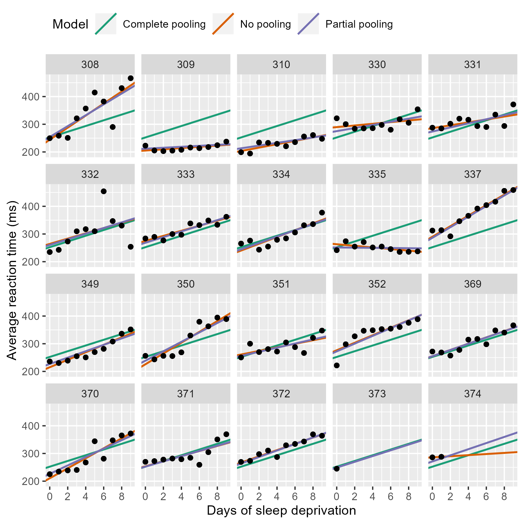
Most of the time, the no pooling and partial pooling lines are on top of each other. But when the two differ, it’s because the partial pooling model’s line is pulled slightly towards the complete-pooling line.
We can appreciate the differences by zooming in on some participants.
df_zoom <- df_models %>%
  filter(Subject %in% c("335", "350", "373", "374"))

p_model_comparison %+% df_zoom
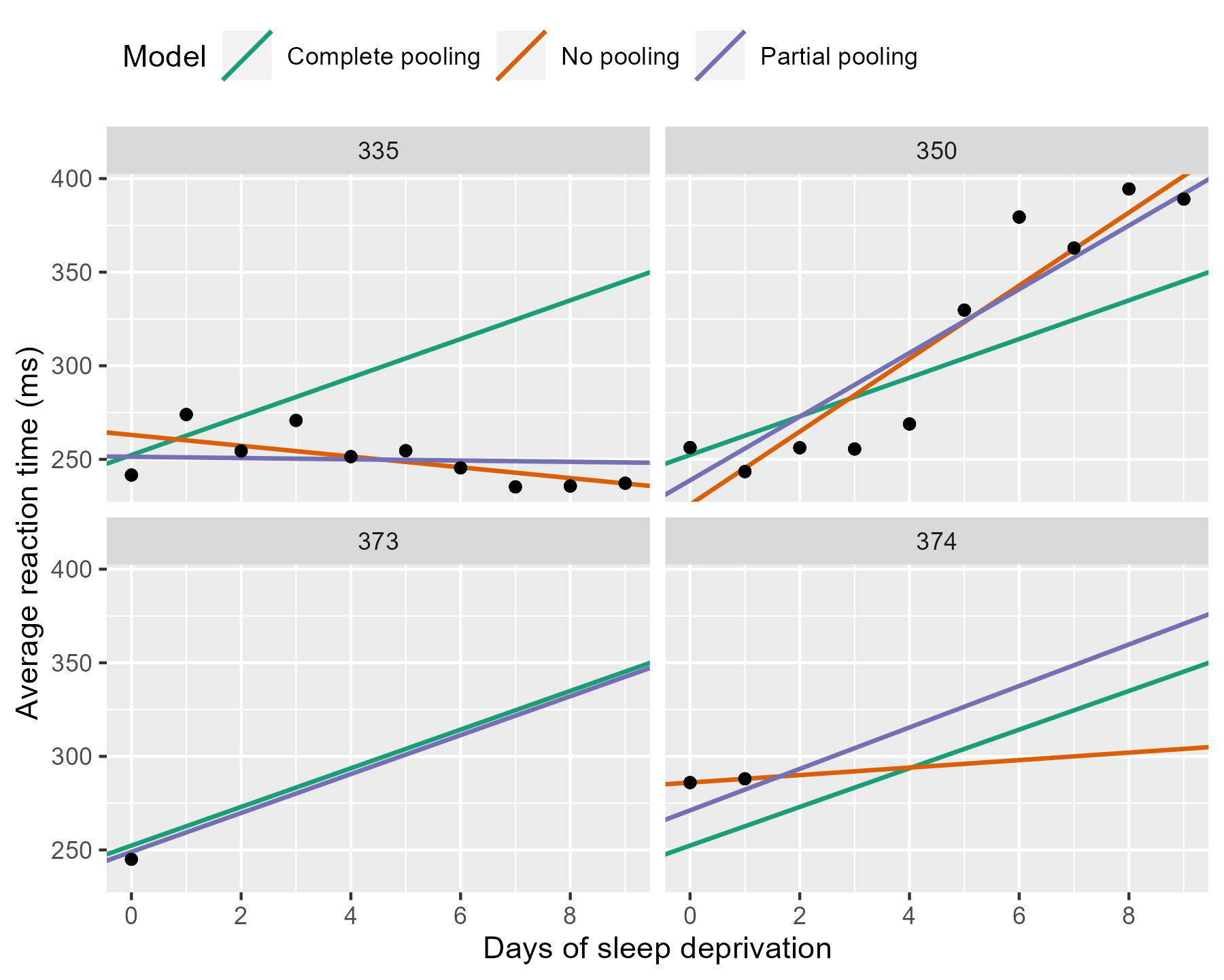
The negative line for 335 from the no pooling model gets a flatter slope in the partial pooling model. The model knows that negative trends are rather unlikely, so the it hedges its bets and pulls that line towards the group average. Something similar happens with 350 where a sharp slope is slightly attenuated. For the participants with incomplete data, the partial pooling model is much more like the complete pooling model. The complete pooling and the partial pooling lines are basically parallel—i.e, they have the same slope. That’s a reasonable guess given so little information.
It’s shrinkage
The partial pooling model pulls more extreme estimates towards an overall average. We can visualize this effect by plotting a scatterplot of intercept and slope parameters from each model and connecting estimates for the same participant.
# Also visualize the point for the fixed effects
df_fixef <- tibble(
  Model = "Partial pooling (average)",
  Intercept = fixef(m)[1],
  Slope_Days = fixef(m)[2]
)

# Complete pooling / fixed effects are center of gravity in the plot
df_gravity <- df_pooled %>%
  distinct(Model, Intercept, Slope_Days) %>%
  bind_rows(df_fixef)
df_gravity
#> # A tibble: 2 × 3
#>   Model                     Intercept Slope_Days
#>   <chr>                         <dbl>      <dbl>
#> 1 Complete pooling               252.       10.3
#> 2 Partial pooling (average)      253.       10.5

df_pulled <- bind_rows(df_no_pooling, df_partial_pooling)

ggplot(df_pulled) +
  aes(x = Intercept, y = Slope_Days, color = Model, shape = Model) +
  geom_point(size = 2) +
  geom_point(
    data = df_gravity,
    size = 5,
    # Prevent size-5 point from showing in legend keys
    show.legend = FALSE
  ) +
  # Draw an arrow connecting the observations between models
  geom_path(
    aes(group = Subject, color = NULL),
    arrow = arrow(length = unit(.02, "npc")),
    show.legend = FALSE
  ) +
  # Use ggrepel to jitter the labels away from the points
  ggrepel::geom_text_repel(
    aes(label = Subject, color = NULL),
    data = df_no_pooling,
    show.legend = FALSE
  ) +
  # Don't forget 373
  ggrepel::geom_text_repel(
    aes(label = Subject, color = NULL),
    data = filter(df_partial_pooling, Subject == "373"),
    show.legend = FALSE
  ) +
  theme(
    legend.position = "bottom",
    legend.justification = "right"
  ) +
  ggtitle("Pooling of regression parameters") +
  xlab("Intercept estimate") +
  ylab("Slope estimate") +
  scale_shape_manual(values = c(15:18)) +
  scale_color_brewer(palette = "Dark2")
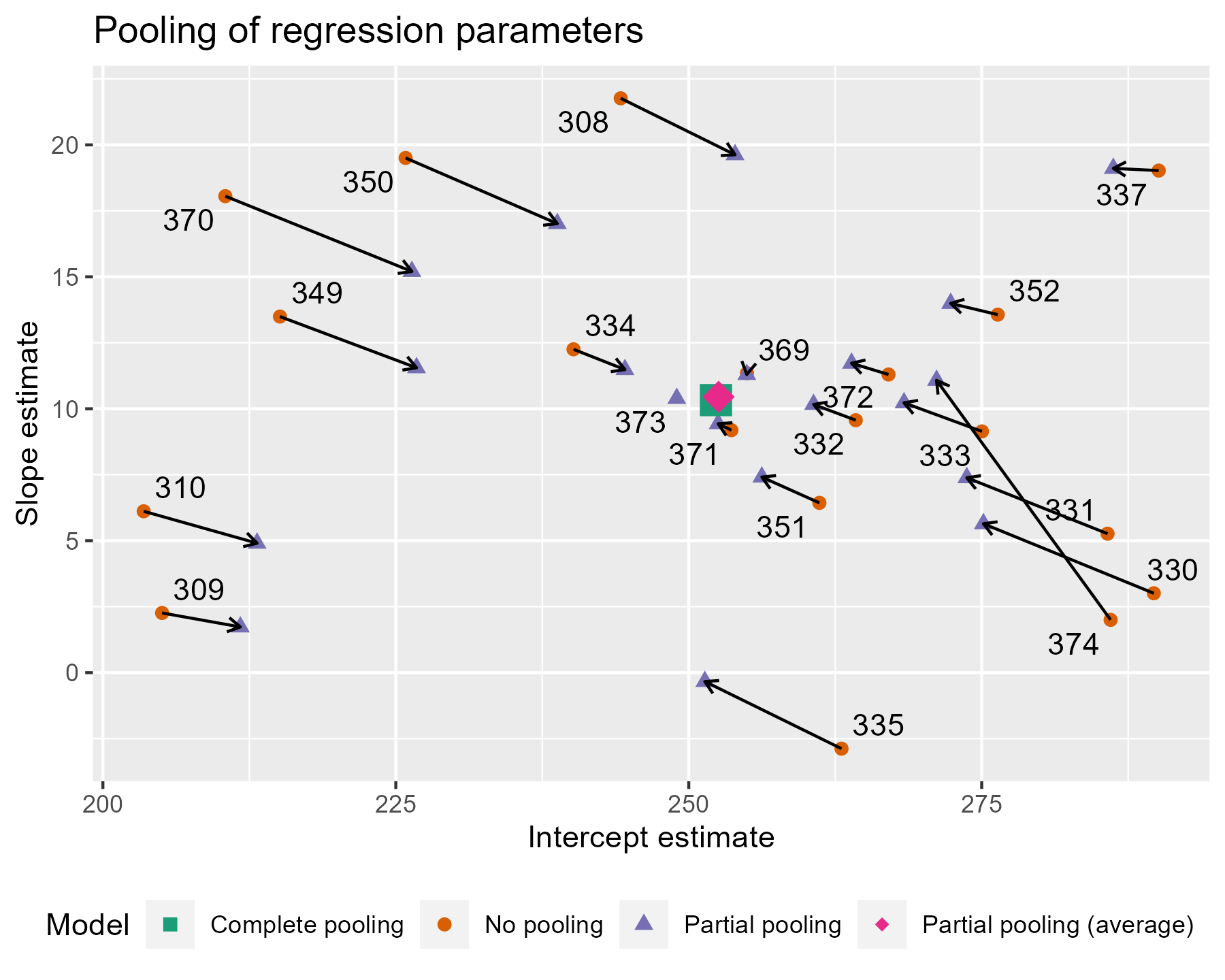
The average intercept and slope act like a center of gravity, pulling values parameter estimates towards it. Hmm, maybe gravity is not quite the right analogy, because the pull is greater for more extreme values. The lines near that center point are very short; they get adjusted very little. The lines in general get longer as we move away from the complete pooling estimate. The fewer the observations in a cluster (here, participants), the more information is borrowed from other clusters, and the greater the pull towards the average estimate. Participant 373 had one observation, so their slope estimate is the average. Likewise, 374 had only two observations, so they get pulled the farthest and receive a slope estimate near the overall average.
This effect is sometimes called shrinkage, because more extreme values shrinkage are pulled towards a more reasonable, more average value. In the lme4 book, Douglas Bates provides an alternative to shrinkage:
The term “shrinkage” may have negative connotations. John Tukey preferred to refer to the process as the estimates for individual subjects “borrowing strength” from each other. This is a fundamental difference in the models underlying mixed-effects models versus strictly fixed effects models. In a mixed-effects model we assume that the levels of a grouping factor are a selection from a population and, as a result, can be expected to share characteristics to some degree. Consequently, the predictions from a mixed-effects model are attenuated relative to those from strictly fixed-effects models.
Shrinkage, borrowing strength 💪 … Another term would also be regularization if we think about how the model avoids overfitting by the taming extreme estimates.
This feature is why I use mixed effects models in my work. If I have a speech discrimination experiment and I want to describe a child’s speech perception ability, I am going to use the partially pooled, shrunken, strength-borrowing, regularized, model-derived estimate of their ability, because it uses more information. It’s that simple to me. Other disciplines might highlight other reasons to use these models, but for me, it’s partially pooling information that’s the most attractive feature.
A topographic map of parameters
For the next visualization, we are going to visualize the distribution of randomly varying effects. Honestly, I am partly including it just so that I have a working ggplot2 version of how to make this plot online. It’s not a routine visualization, but it reveals a little more about where estimates are being pulled towards.
I already remarked that the model estimates a distribution of intercept and slope effects. We know where the center of that distribution is: It’s the fixed effects estimate, the center of gravity in the last plot. What the model also needs to estimate is the variability/spread of values around that center. Also, intercepts and slopes might be correlated: Maybe the effect of an additional day on reaction time is diminished for participants who are slower to respond in general. So, the model also estimates the correlation of those effects too.
Imagine that the last plot is a landscape, and fixed effects point is the peak of a hill. What were are going to do is draw a topographic map with contour lines to show different elevation regions on that hill.
First, we need to extract the covariance matrix estimated by the model.
# Extract the matrix
cov_mat <- VarCorr(m)[["Subject"]]

# Strip off some details so that just the useful part is printed
attr(cov_mat, "stddev") <- NULL
attr(cov_mat, "correlation") <- NULL
cov_mat
#>             (Intercept)      Days
#> (Intercept)  582.717345  9.897673
#> Days           9.897673 35.033088
The ellipse() function takes a covariance matrix, a
center value, and quantile/confidence level and returns the points from
an oval around the center at the given confidence level. We create five
ellipses for different quantile levels.
library(ellipse)
#>
#> Attaching package: 'ellipse'
#> The following object is masked from 'package:graphics':
#>
#>     pairs

# Helper function to make a data-frame of ellipse points that
# includes the level as a column
make_ellipse <- function(cov_mat, center, level) {
  ellipse(cov_mat, centre = center, level = level) %>%
    as.data.frame() %>%
    add_column(level = level) %>%
    as_tibble()
}

center <- fixef(m)
levels <- c(.1, .3, .5, .7, .9)

# Create an ellipse dataframe for each of the levels defined
# above and combine them
df_ellipse <- levels %>%
  lapply(
    function(x) make_ellipse(cov_mat, center, level = x)
  ) %>%
  bind_rows() %>%
  rename(Intercept = `(Intercept)`, Slope_Days = Days)

df_ellipse
#> # A tibble: 500 × 3
#>    Intercept Slope_Days level
#>        <dbl>      <dbl> <dbl>
#>  1      261.       12.4   0.1
#>  2      260.       12.6   0.1
#>  3      260.       12.7   0.1
#>  4      259.       12.8   0.1
#>  5      258.       12.8   0.1
#>  6      258.       12.9   0.1
#>  7      257.       13.0   0.1
#>  8      257.       13.0   0.1
#>  9      256.       13.1   0.1
#> 10      255.       13.1   0.1
#> # … with 490 more rows
Then we add them onto our previous plot.
ggplot(df_pulled) +
  aes(x = Intercept, y = Slope_Days, color = Model, shape = Model) +
  # Draw contour lines from the distribution of effects
  geom_path(
    aes(group = level, color = NULL, shape = NULL),
    data = df_ellipse,
    linetype = "dashed",
    color = "grey40"
  ) +
  geom_point(
    aes(shape = Model),
    data = df_gravity,
    size = 5,
    show.legend = FALSE
  ) +
  geom_point(size = 2) +
  geom_path(
    aes(group = Subject, color = NULL),
    arrow = arrow(length = unit(.02, "npc")),
    show.legend = FALSE
  ) +
  theme(
    legend.position = "bottom",
    legend.justification = "right"
  ) +
  ggtitle("Topographic map of regression parameters") +
  xlab("Intercept estimate") +
  ylab("Slope estimate") +
  scale_color_brewer(palette = "Dark2") +
  scale_shape_manual(values = c(15:18))
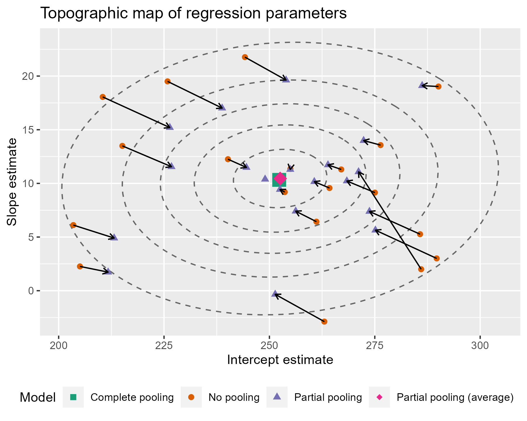
The ellipses provide a little more information about where the estimates are being pulled. Even if some of the points are not being pulled directly towards the center of gravity, nearly all of them are being pulled into a higher confidence region.
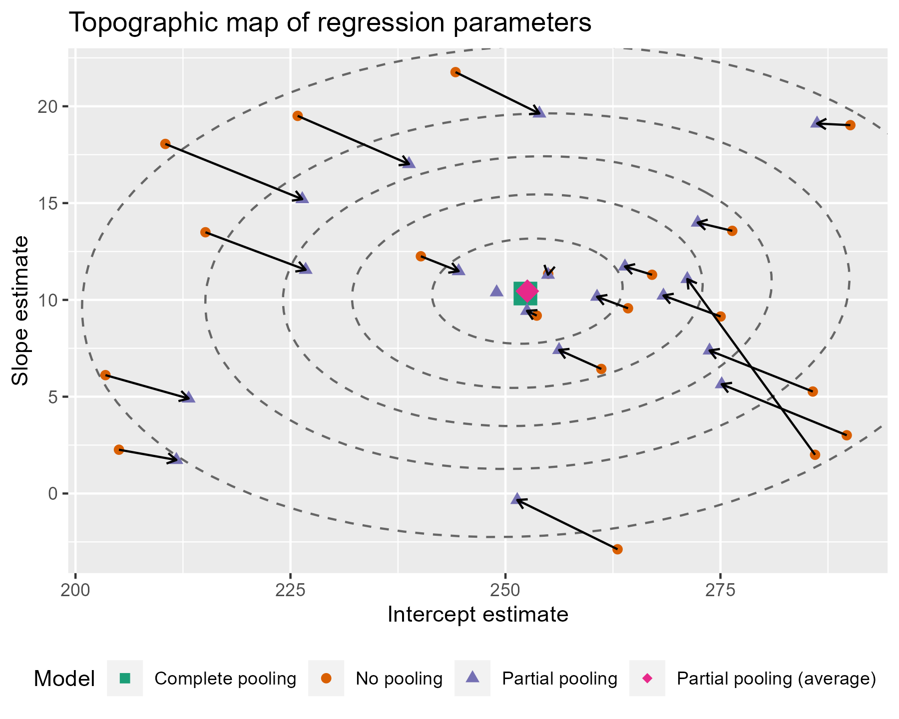
There are a few tweaks we might consider for this plot. I don’t think
the ovals need to be contained in the plot. The points are more
important, and the plotting boundaries should be set with respect to the
points. We can redefine the limits by using
coord_cartesian(). (Your aesthetic preferences
may differ. That’s fine.)
last_plot() +
  coord_cartesian(
    xlim = range(df_pulled$Intercept),
    ylim = range(df_pulled$Slope_Days),
    expand = TRUE
  )
To go all out 😎, let’s also label the contours with the confidence levels. I see that the lower left area is relatively free of points, so I can place the labels there. I filter down to just the ellipse points in the bottom 25% of x and y values. That will keep points in that lower left quadrant. Then I find the (x, y) point with the farthest distance from the center as the location for my label. I make it sound so easy but it took a lot of trial and error (including an an attempt to use cosines).
# Euclidean distance
contour_dist <- function(xs, ys, center_x, center_y) {
  x_diff <- (center_x - xs) ^ 2
  y_diff <- (center_y - ys) ^ 2
  sqrt(x_diff + y_diff)
}

# Find the point to label in each ellipse.
df_label_locations <- df_ellipse %>%
  group_by(level) %>%
  filter(
    Intercept < quantile(Intercept, .25),
    Slope_Days < quantile(Slope_Days, .25)
  ) %>%
  # Compute distance from center.
  mutate(
    dist = contour_dist(Intercept, Slope_Days, fixef(m)[1], fixef(m)[2])
  ) %>%
  # Keep smallest values.
  top_n(-1, wt = dist) %>%
  ungroup()

# Tweak the last plot one more time!
last_plot() +
  geom_text(
    aes(label = level, color = NULL, shape = NULL),
    data = df_label_locations,
    nudge_x = .5,
    nudge_y = .8,
    size = 3.5,
    color = "grey40"
  )

Are you feeling satisfied? I feel satisfied.
Bonus: Plotting lines from a Bayesian mixed effects model
This last part is more of a code demo than a walkthrough. I call myself a Bayesian. Visualizing uncertainty is one of my things here, so I would be remiss if I didn’t also demo how to do some plots using posterior samples.
Conceptually, the classical model above estimated a single set of partially pooled regression lines. With the Bayesian model, we can sample from a posterior distribution of partially pooled regression lines. Instead of one line for each participant, there’s an entire distribution of them for each participant. This distribution lets us quantify our uncertainty about each part of our model.
First, we fit the model in RStanARM with weakly informative priors.
library(rstanarm)
#> Loading required package: Rcpp
#> This is rstanarm version 2.21.3
#> - See https://mc-stan.org/rstanarm/articles/priors for changes to default priors!
#> - Default priors may change, so it's safest to specify priors, even if equivalent to the defaults.
#> - For execution on a local, multicore CPU with excess RAM we recommend calling
#>   options(mc.cores = parallel::detectCores())
# Update 2021-02: Prior to mid-2020 priors were autoscaled (so `autoscale =
# TRUE`) was implicity set. But now they are no longer autoscaled. The code has
# been updated to use the autoscaling.
b <- stan_glmer(
  Reaction ~ Days + (Days | Subject),
  family = gaussian(),
  data = df_sleep,
  prior = normal(0, 2, autoscale = TRUE),
  prior_intercept = normal(0, 5, autoscale = TRUE),
  prior_covariance = decov(regularization = 2),
  prior_aux = cauchy(0, 1, autoscale = TRUE),
  # reproducible blogging
  seed = 20211116
)
We get a similar overview as arm::display() when
we print the model.
b
#> stan_glmer
#>  family:       gaussian [identity]
#>  formula:      Reaction ~ Days + (Days | Subject)
#>  observations: 183
#> ------
#>             Median MAD_SD
#> (Intercept) 252.3    6.2
#> Days         10.4    1.7
#>
#> Auxiliary parameter(s):
#>       Median MAD_SD
#> sigma 25.7    1.6
#>
#> Error terms:
#>  Groups   Name        Std.Dev. Corr
#>  Subject  (Intercept) 24
#>           Days         7       0.06
#>  Residual             26
#> Num. levels: Subject 20
#>
#> ------
#> * For help interpreting the printed output see ?print.stanreg
#> * For info on the priors used see ?prior_summary.stanreg
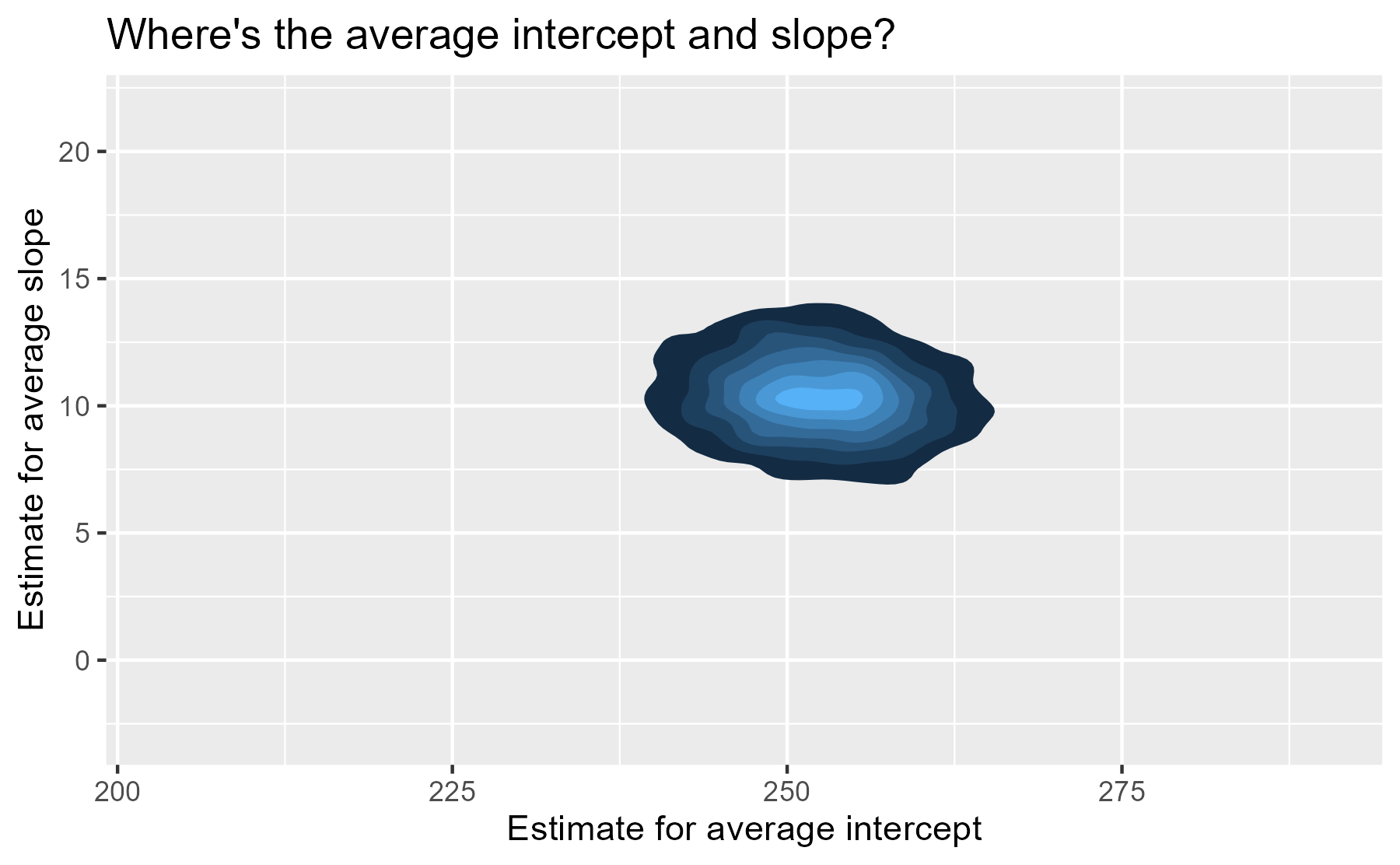
We have posterior distribution of values now! That means instead of one
“center of gravity” point, we have 4,000 plausible points for our
central value. The center of our former contour plot has its own contour
plot. That’s Bayes for you. We can plot that easily with
stat_density_2d(). We set the coordinate limits
to be the same as the last plot, just so that we don’t exaggerate the
uncertainty around the central point by drawing a gigantic contour
surface.
# Get a dataframe: One row per posterior sample
df_posterior <- b %>%
  as.data.frame() %>%
  as_tibble()

ggplot(df_posterior) +
  aes(x = `(Intercept)`, y = `Days`) +
  # Calculate the density
  stat_density_2d(aes(fill = stat(level)), geom = "polygon") +
  ggtitle("Where's the average intercept and slope?") +
  xlab("Estimate for average intercept") +
  ylab("Estimate for average slope") +
  # Use the same coordinate limits as last plot
  coord_cartesian(
    xlim = range(df_pulled$Intercept),
    ylim = range(df_pulled$Slope_Days),
    expand = TRUE
  ) +
  guides(fill = "none")
For each participant, we have 4,000 partially-pooled regression lines too, so we can visualize our uncertainty for each participant’s individual regression line.
Let’s finish by drawing a sample of those lines for a faceted plot. We have to do a bunch of data wrangling to get a dataframe with one row per subject per posterior sample.
# For each sample, add the average intercept and average slope values to each
# participant's deviation from that average. These yields the intercept and
# slope parameters for each participant.
df_effects <- df_posterior %>%
  mutate(
    # Find all the columns with the pattern "b[(Intercept". Add the column
    # `(Intercept)` to each of those columns.
    across(
      .cols = matches("b\\[\\(Intercept"),
      .fns = ~ . + `(Intercept)`
    ),
    # Again for slope
    across(
      .cols = matches("b\\[Day"),
      .fns = ~ . + Days
    )
  )

# Convert to a long format
df_long_effects <- df_effects %>%
  select(matches("b\\[")) %>%
  rowid_to_column("draw") %>%
  tidyr::pivot_longer(
    cols = c(-draw),
    # when we make new columns with pivot_ functions, the
    # they get quotes
    names_to = "Parameter",
    values_to = "Value"
  )

# Extract the effect type and subject number from each parameter name
df_long_effects <- df_long_effects %>%
  mutate(
    Effect = Parameter %>%
      stringr::str_detect("Intercept") %>%
      ifelse(., "Intercept", "Slope_Day"),
    Subject = Parameter %>%
      stringr::str_extract("\\d\\d\\d")
  ) %>%
  select(draw, Subject, Effect, Value)

# Finally!
df_long_effects
#> # A tibble: 160,000 × 4
#>     draw Subject Effect     Value
#>    <int> <chr>   <chr>      <dbl>
#>  1     1 308     Intercept 256.
#>  2     1 308     Slope_Day  19.5
#>  3     1 309     Intercept 208.
#>  4     1 309     Slope_Day   2.49
#>  5     1 310     Intercept 197.
#>  6     1 310     Slope_Day   9.00
#>  7     1 330     Intercept 281.
#>  8     1 330     Slope_Day   5.21
#>  9     1 331     Intercept 307.
#> 10     1 331     Slope_Day   1.16
#> # … with 159,990 more rows
Now that we have the data in the right shape, we are going randomly choose 50 posterior samples and plot those lines alongside the observed data.
# For reproducibility
set.seed(20220330)

df_samples <- df_long_effects %>%
  filter(draw %in% sample(1:4000, size = 50)) %>%
  tidyr::pivot_wider(names_from = Effect, values_from = Value)
df_samples
#> # A tibble: 1,000 × 4
#>     draw Subject Intercept Slope_Day
#>    <int> <chr>       <dbl>     <dbl>
#>  1    93 308          254.    17.6
#>  2    93 309          217.     2.87
#>  3    93 310          202.     5.61
#>  4    93 330          250.    11.7
#>  5    93 331          262.     8.65
#>  6    93 332          242.    12.0
#>  7    93 333          258.    15.8
#>  8    93 334          232.    12.2
#>  9    93 335          240.     0.869
#> 10    93 337          283.    18.9
#> # … with 990 more rows

ggplot(df_sleep) +
  aes(x = Days, y = Reaction) +
  geom_abline(
    aes(intercept = Intercept, slope = Slope_Day),
    data = df_samples,
    color = "#3366FF",
    alpha = .1
  ) +
  geom_point() +
  facet_wrap("Subject") +
  scale_x_continuous(breaks = 0:4 * 2) +
  labs(x = xlab, y = ylab)
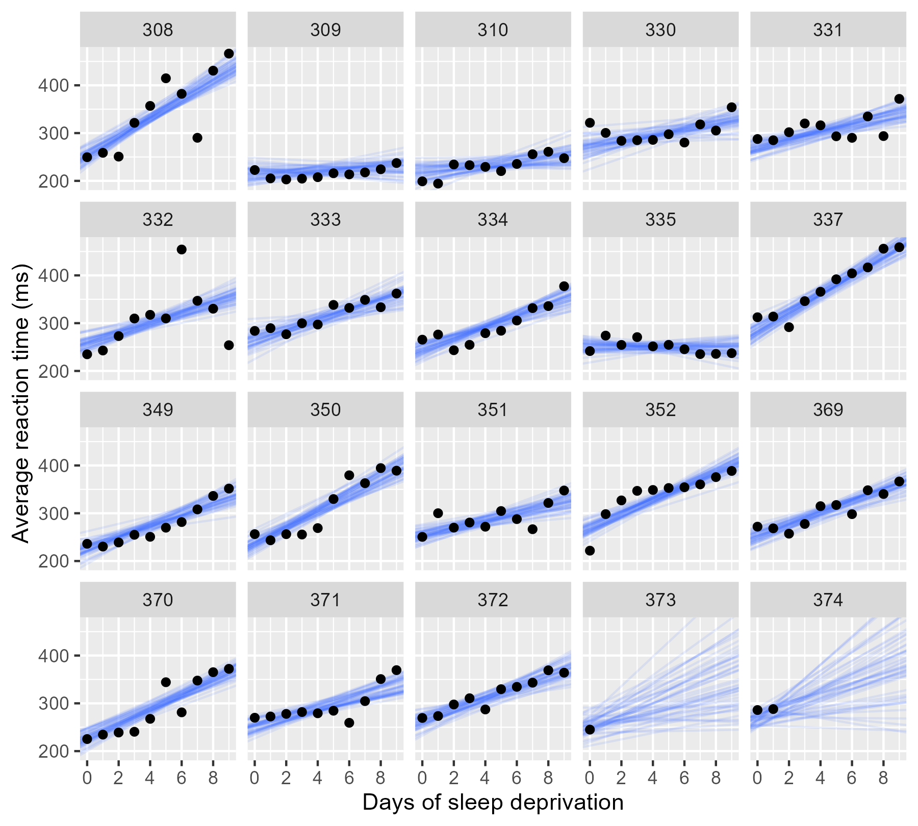
For the participants with complete data, the lines pile up and form a narrow band, indicating a low degree of uncertainty. In the final two panels, however, we only have limited data, and the sample of lines fan out and cover many different plausible trajectories.
The uncertainty is more dramatic if we draw a contour plot for each participant—basically, drawing each participants’ mostly likely locations in the landscape of parameter values.
df_effects_all_wide <- df_long_effects %>%
  tidyr::pivot_wider(names_from = Effect, values_from = Value)

ggplot(df_effects_all_wide) +
  aes(x = Intercept, y = Slope_Day) +
  stat_density_2d(
    aes(fill = stat(level)),
    geom = "polygon",
    # normalized density so all colors appear in each plot
    contour_var = "ndensity"
  ) +
  facet_wrap("Subject") +
  xlab("Intercept estimate") +
  ylab("Slope estimate") +
  guides(fill = "none")
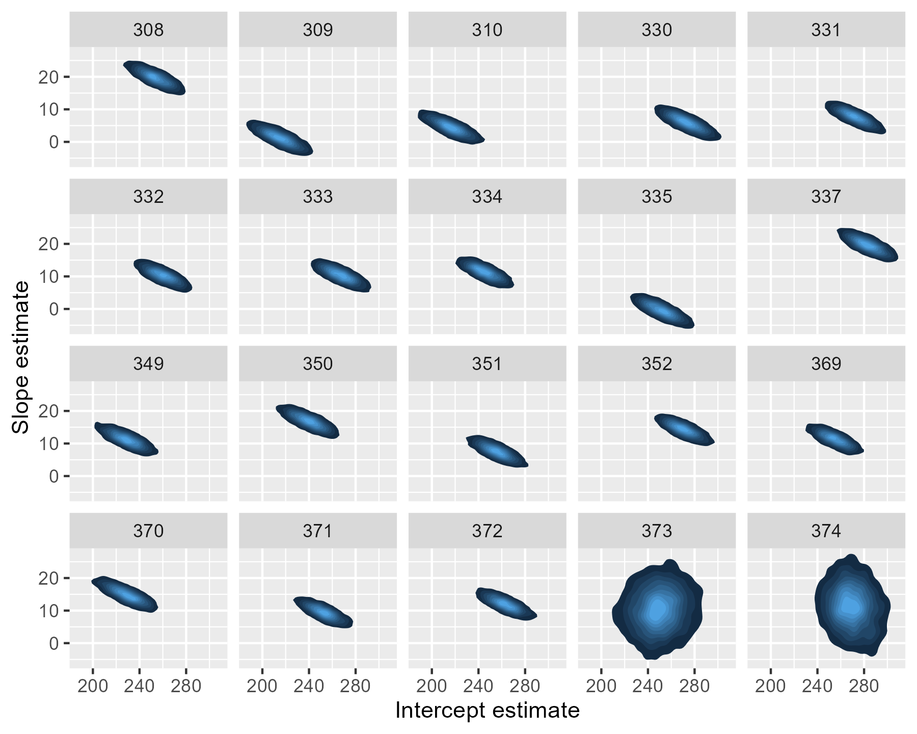
For 373 and 374, the contour regions/ink-splats are very tall: A lot of slope values are plausible. The region for 374 is more off center and slightly narrow than that of 373: That extra data point matters.
Funnily enough, this post started as a quick write-up of a demo I wrote, but it kind of spiraled out of control. I hope this write-up helps students and users understand mixed-effects models at a more intuitive level.
I had formally learned about these models twice in graduate school. In psychology, we were told to use them if we wanted to make inferences about a larger population of subjects or stimulus items. In educational psychology, we were told to use them to capture the sources of variances in a nested data-set: Kids nested in classrooms nested in schools, etc. It wasn’t until I taught myself Bayesian stats that I learned about third reason to use them: They pool information across different units, providing regularized model estimates. I find this rationale most intuitive. The Gelman and Hill book and Statistical Rethinking both discuss the partial pooling description of these models. (Ooooh, as I added the Rethinking link, I just noticed that I created a ggplot2 version of the plot from the cover of that book. 😆)
Last knitted on 2022-05-27. Source code on GitHub.1
-
.session_info
#> ─ Session info ───────────────────────────────────────────────────────────────
#>  setting      value
#>  version      R version 4.2.0 (2022-04-22 ucrt)
#>  os           Windows 10 x64 (build 22000)
#>  system       x86_64, mingw32
#>  ui           RTerm
#>  language     (EN)
#>  collate      English_United States.utf8
#>  ctype        English_United States.utf8
#>  tz           America/Chicago
#>  date         2022-05-27
#>  pandoc       NA
#>  stan (rstan) 2.21.0
#>
#> ─ Packages ───────────────────────────────────────────────────────────────────
#>  ! package      * version  date (UTC) lib source
#>    abind          1.4-5    2016-07-21 [1] CRAN (R 4.2.0)
#>    arm            1.12-2   2021-10-15 [1] CRAN (R 4.2.0)
#>    assertthat     0.2.1    2019-03-21 [1] CRAN (R 4.2.0)
#>    base64enc      0.1-3    2015-07-28 [1] CRAN (R 4.2.0)
#>    bayesplot      1.9.0    2022-03-10 [1] CRAN (R 4.2.0)
#>    boot           1.3-28   2021-05-03 [2] CRAN (R 4.2.0)
#>    cachem         1.0.6    2021-08-19 [1] CRAN (R 4.2.0)
#>    callr          3.7.0    2021-04-20 [1] CRAN (R 4.2.0)
#>    cli            3.3.0    2022-04-25 [1] CRAN (R 4.2.0)
#>    coda           0.19-4   2020-09-30 [1] CRAN (R 4.2.0)
#>    codetools      0.2-18   2020-11-04 [2] CRAN (R 4.2.0)
#>    colorspace     2.0-3    2022-02-21 [1] CRAN (R 4.2.0)
#>    colourpicker   1.1.1    2021-10-04 [1] CRAN (R 4.2.0)
#>    crayon         1.5.1    2022-03-26 [1] CRAN (R 4.2.0)
#>    crosstalk      1.2.0    2021-11-04 [1] CRAN (R 4.2.0)
#>    DBI            1.1.2    2021-12-20 [1] CRAN (R 4.2.0)
#>    digest         0.6.29   2021-12-01 [1] CRAN (R 4.2.0)
#>    downlit        0.4.0    2021-10-29 [1] CRAN (R 4.2.0)
#>    dplyr        * 1.0.9    2022-04-28 [1] CRAN (R 4.2.0)
#>    DT             0.23     2022-05-10 [1] CRAN (R 4.2.0)
#>    dygraphs       1.1.1.6  2018-07-11 [1] CRAN (R 4.2.0)
#>    ellipse      * 0.4.2    2020-05-27 [1] CRAN (R 4.2.0)
#>    ellipsis       0.3.2    2021-04-29 [1] CRAN (R 4.2.0)
#>    evaluate       0.15     2022-02-18 [1] CRAN (R 4.2.0)
#>    fansi          1.0.3    2022-03-24 [1] CRAN (R 4.2.0)
#>    farver         2.1.0    2021-02-28 [1] CRAN (R 4.2.0)
#>    fastmap        1.1.0    2021-01-25 [1] CRAN (R 4.2.0)
#>    generics       0.1.2    2022-01-31 [1] CRAN (R 4.2.0)
#>    ggplot2      * 3.3.6    2022-05-03 [1] CRAN (R 4.2.0)
#>    ggrepel        0.9.1    2021-01-15 [1] CRAN (R 4.2.0)
#>    ggridges       0.5.3    2021-01-08 [1] CRAN (R 4.2.0)
#>    git2r          0.30.1   2022-03-16 [1] CRAN (R 4.2.0)
#>    glue           1.6.2    2022-02-24 [1] CRAN (R 4.2.0)
#>    gridExtra      2.3      2017-09-09 [1] CRAN (R 4.2.0)
#>    gtable         0.3.0    2019-03-25 [1] CRAN (R 4.2.0)
#>    gtools         3.9.2.1  2022-05-23 [1] CRAN (R 4.2.0)
#>    here           1.0.1    2020-12-13 [1] CRAN (R 4.2.0)
#>    highr          0.9      2021-04-16 [1] CRAN (R 4.2.0)
#>    htmltools      0.5.2    2021-08-25 [1] CRAN (R 4.2.0)
#>    htmlwidgets    1.5.4    2021-09-08 [1] CRAN (R 4.2.0)
#>    httpuv         1.6.5    2022-01-05 [1] CRAN (R 4.2.0)
#>    igraph         1.3.1    2022-04-20 [1] CRAN (R 4.2.0)
#>    inline         0.3.19   2021-05-31 [1] CRAN (R 4.2.0)
#>    isoband        0.2.5    2021-07-13 [1] CRAN (R 4.2.0)
#>    knitr        * 1.39     2022-04-26 [1] CRAN (R 4.2.0)
#>    labeling       0.4.2    2020-10-20 [1] CRAN (R 4.2.0)
#>    later          1.3.0    2021-08-18 [1] CRAN (R 4.2.0)
#>    lattice        0.20-45  2021-09-22 [2] CRAN (R 4.2.0)
#>    lifecycle      1.0.1    2021-09-24 [1] CRAN (R 4.2.0)
#>    lme4         * 1.1-29   2022-04-07 [1] CRAN (R 4.2.0)
#>    loo            2.5.1    2022-03-24 [1] CRAN (R 4.2.0)
#>    magrittr       2.0.3    2022-03-30 [1] CRAN (R 4.2.0)
#>    markdown       1.1      2019-08-07 [1] CRAN (R 4.2.0)
#>    MASS           7.3-56   2022-03-23 [2] CRAN (R 4.2.0)
#>    Matrix       * 1.4-1    2022-03-23 [2] CRAN (R 4.2.0)
#>    matrixStats    0.62.0   2022-04-19 [1] CRAN (R 4.2.0)
#>    memoise        2.0.1    2021-11-26 [1] CRAN (R 4.2.0)
#>    mgcv           1.8-40   2022-03-29 [2] CRAN (R 4.2.0)
#>    mime           0.12     2021-09-28 [1] CRAN (R 4.2.0)
#>    miniUI         0.1.1.1  2018-05-18 [1] CRAN (R 4.2.0)
#>    minqa          1.2.4    2014-10-09 [1] CRAN (R 4.2.0)
#>    munsell        0.5.0    2018-06-12 [1] CRAN (R 4.2.0)
#>    nlme           3.1-157  2022-03-25 [2] CRAN (R 4.2.0)
#>    nloptr         2.0.2    2022-05-19 [1] CRAN (R 4.2.0)
#>    pillar         1.7.0    2022-02-01 [1] CRAN (R 4.2.0)
#>    pkgbuild       1.3.1    2021-12-20 [1] CRAN (R 4.2.0)
#>    pkgconfig      2.0.3    2019-09-22 [1] CRAN (R 4.2.0)
#>    plyr           1.8.7    2022-03-24 [1] CRAN (R 4.2.0)
#>    prettyunits    1.1.1    2020-01-24 [1] CRAN (R 4.2.0)
#>    processx       3.5.3    2022-03-25 [1] CRAN (R 4.2.0)
#>    promises       1.2.0.1  2021-02-11 [1] CRAN (R 4.2.0)
#>    ps             1.7.0    2022-04-23 [1] CRAN (R 4.2.0)
#>    purrr          0.3.4    2020-04-17 [1] CRAN (R 4.2.0)
#>    R6             2.5.1    2021-08-19 [1] CRAN (R 4.2.0)
#>    ragg           1.2.2    2022-02-21 [1] CRAN (R 4.2.0)
#>    RColorBrewer   1.1-3    2022-04-03 [1] CRAN (R 4.2.0)
#>    Rcpp         * 1.0.8.3  2022-03-17 [1] CRAN (R 4.2.0)
#>  D RcppParallel   5.1.5    2022-01-05 [1] CRAN (R 4.2.0)
#>    reshape2       1.4.4    2020-04-09 [1] CRAN (R 4.2.0)
#>    rlang          1.0.2    2022-03-04 [1] CRAN (R 4.2.0)
#>    rprojroot      2.0.3    2022-04-02 [1] CRAN (R 4.2.0)
#>    rstan          2.21.5   2022-04-11 [1] CRAN (R 4.2.0)
#>    rstanarm     * 2.21.3   2022-04-09 [1] CRAN (R 4.2.0)
#>    rstantools     2.2.0    2022-04-08 [1] CRAN (R 4.2.0)
#>    rstudioapi     0.13     2020-11-12 [1] CRAN (R 4.2.0)
#>    scales         1.2.0    2022-04-13 [1] CRAN (R 4.2.0)
#>    sessioninfo    1.2.2    2021-12-06 [1] CRAN (R 4.2.0)
#>    shiny          1.7.1    2021-10-02 [1] CRAN (R 4.2.0)
#>    shinyjs        2.1.0    2021-12-23 [1] CRAN (R 4.2.0)
#>    shinystan      2.6.0    2022-03-03 [1] CRAN (R 4.2.0)
#>    shinythemes    1.2.0    2021-01-25 [1] CRAN (R 4.2.0)
#>    StanHeaders    2.21.0-7 2020-12-17 [1] CRAN (R 4.2.0)
#>    stringi        1.7.6    2021-11-29 [1] CRAN (R 4.2.0)
#>    stringr        1.4.0    2019-02-10 [1] CRAN (R 4.2.0)
#>    survival       3.3-1    2022-03-03 [2] CRAN (R 4.2.0)
#>    systemfonts    1.0.4    2022-02-11 [1] CRAN (R 4.2.0)
#>    textshaping    0.3.6    2021-10-13 [1] CRAN (R 4.2.0)
#>    threejs        0.3.3    2020-01-21 [1] CRAN (R 4.2.0)
#>    tibble       * 3.1.7    2022-05-03 [1] CRAN (R 4.2.0)
#>    tidyr          1.2.0    2022-02-01 [1] CRAN (R 4.2.0)
#>    tidyselect     1.1.2    2022-02-21 [1] CRAN (R 4.2.0)
#>    utf8           1.2.2    2021-07-24 [1] CRAN (R 4.2.0)
#>    vctrs          0.4.1    2022-04-13 [1] CRAN (R 4.2.0)
#>    withr          2.5.0    2022-03-03 [1] CRAN (R 4.2.0)
#>    xfun           0.31     2022-05-10 [1] CRAN (R 4.2.0)
#>    xtable         1.8-4    2019-04-21 [1] CRAN (R 4.2.0)
#>    xts            0.12.1   2020-09-09 [1] CRAN (R 4.2.0)
#>    zoo            1.8-10   2022-04-15 [1] CRAN (R 4.2.0)
#>
#>  [1] C:/Users/Tristan/AppData/Local/R/win-library/4.2
#>  [2] C:/Program Files/R/R-4.2.0/library
#>
#>  D ── DLL MD5 mismatch, broken installation.
#>
#> ──────────────────────────────────────────────────────────────────────────────

Leave a comment