As part of my tutorial talk on RStanARM, I presented some examples of how to visualize the uncertainty in Bayesian linear regression models. This post is an expanded demonstration of the approaches I presented in that tutorial.
Data: Does brain mass predict how much mammals sleep in a day?
Let’s use the mammal sleep dataset from ggplot2. This dataset contains the number of hours spent sleeping per day for 83 different species of mammals along with each species’ brain mass (kg) and body mass (kg), among other measures. Here’s a first look at the data.
library(dplyr, warn.conflicts = FALSE)
library(ggplot2)

# Preview sorted by brain/body ratio. I chose this sorting so that humans would
# show up in the preview.
msleep %>%
  select(name, sleep_total, brainwt, bodywt, everything()) %>%
  arrange(desc(brainwt / bodywt))
#> # A tibble: 83 × 11
#>    name      sleep_total brainwt bodywt genus vore  order conservation sleep_rem
#>    <chr>           <dbl>   <dbl>  <dbl> <chr> <chr> <chr> <chr>            <dbl>
#>  1 Thirteen…        13.8 0.004    0.101 Sper… herbi Rode… lc                 3.4
#>  2 Owl monk…        17   0.0155   0.48  Aotus omni  Prim… <NA>               1.8
#>  3 Lesser s…         9.1 0.00014  0.005 Cryp… omni  Sori… lc                 1.4
#>  4 Squirrel…         9.6 0.02     0.743 Saim… omni  Prim… <NA>               1.4
#>  5 Macaque          10.1 0.179    6.8   Maca… omni  Prim… <NA>               1.2
#>  6 Little b…        19.9 0.00025  0.01  Myot… inse… Chir… <NA>               2
#>  7 Galago            9.8 0.005    0.2   Gala… omni  Prim… <NA>               1.1
#>  8 Mole rat         10.6 0.003    0.122 Spal… <NA>  Rode… <NA>               2.4
#>  9 Tree shr…         8.9 0.0025   0.104 Tupa… omni  Scan… <NA>               2.6
#> 10 Human             8   1.32    62     Homo  omni  Prim… <NA>               1.9
#> # … with 73 more rows, and 2 more variables: sleep_cycle <dbl>, awake <dbl>

ggplot(msleep) +
  aes(x = brainwt, y = sleep_total) +
  geom_point()
#> Warning: Removed 27 rows containing missing values (geom_point).
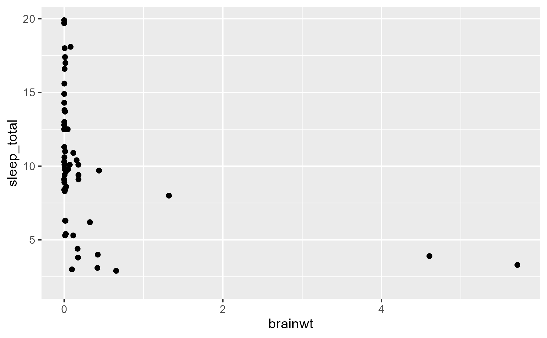
Hmmm, not very helpful! We should put our measures on a log-10 scale. Also, 27 of the species don’t have brain mass data, so we’ll exclude those rows for the rest of this tutorial.
msleep <- msleep %>%
  filter(!is.na(brainwt)) %>%
  mutate(
    log_brainwt = log10(brainwt),
    log_bodywt = log10(bodywt),
    log_sleep_total = log10(sleep_total)
  )
Now, plot the log-transformed data. But let’s also get a little fancy and label the points for some example critters 🐱 so that we can get some intuition about the data in this scaling. (Plus, I wanted to try out the annotation tips from the R4DS book.)
# Create a separate data-frame of species to highlight
ex_mammals <- c(
  "Domestic cat", "Human", "Dog", "Cow", "Rabbit",
  "Big brown bat", "House mouse", "Horse", "Golden hamster"
)

# We will give some familiar species shorter names
renaming_rules <- c(
  "Domestic cat" = "Cat",
  "Golden hamster" = "Hamster",
  "House mouse" = "Mouse"
)

ex_points <- msleep %>%
  filter(name %in% ex_mammals) %>%
  mutate(name = stringr::str_replace_all(name, renaming_rules))

# Define these labels only once for all the plots
lab_lines <- list(
  brain_log = "Brain mass (kg., log-scaled)",
  sleep_raw = "Sleep per day (hours)",
  sleep_log = "Sleep per day (log-hours)"
)

ggplot(msleep) +
  aes(x = brainwt, y = sleep_total) +
  geom_point(color = "grey40") +
  # Circles around highlighted points + labels
  geom_point(size = 3, shape = 1, color = "grey40", data = ex_points) +
  ggrepel::geom_text_repel(aes(label = name), data = ex_points) +
  # Use log scaling on x-axis
  scale_x_log10(breaks = c(.001, .01, .1, 1)) +
  labs(x = lab_lines$brain_log, y = lab_lines$sleep_raw)
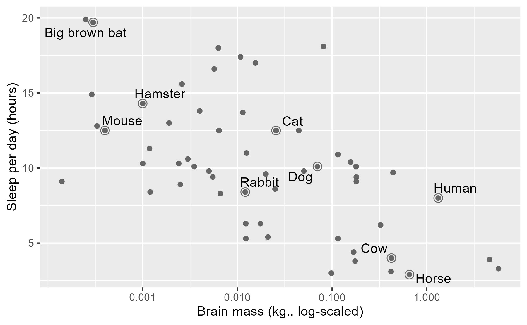
As a child growing up on a dairy farm 🐮, it was remarkable to me how little I saw cows sleeping, compared to dogs or cats. Were they okay? Are they constantly tired and groggy? Maybe they are asleep when I’m asleep? Here, it looks like they just don’t need very much sleep.
Next, let’s fit a classical regression model. We will use a log-scaled sleep measure so that the regression line doesn’t imply negative sleep (even though brains never get that large).
m1_classical <- lm(log_sleep_total ~ log_brainwt, data = msleep)
arm::display(m1_classical)
#> lm(formula = log_sleep_total ~ log_brainwt, data = msleep)
#>             coef.est coef.se
#> (Intercept)  0.74     0.04
#> log_brainwt -0.13     0.02
#> ---
#> n = 56, k = 2
#> residual sd = 0.17, R-Squared = 0.40
We can interpret the model in the usual way: A mammal with 1 kg (0 log-kg) of brain mass sleeps 100.74 = 5.5 hours per day. A mammal with a tenth of that brain mass (-1 log-kg) sleeps 100.74 + 0.13 = 7.4 hours.
We illustrate the regression results to show the predicted mean of y and
its 95% confidence interval. This task is readily accomplished in ggplot2 using
stat_smooth(). This function fits a model and plots the mean and CI for each
aesthetic grouping of data1 in a plot.
ggplot(msleep) +
  aes(x = log_brainwt, y = log_sleep_total) +
  geom_point() +
  stat_smooth(method = "lm", level = .95) +
  scale_x_continuous(labels = function(x) 10 ^ x) +
  labs(x = lab_lines$brain_log, y = lab_lines$sleep_log)
#> `geom_smooth()` using formula 'y ~ x'
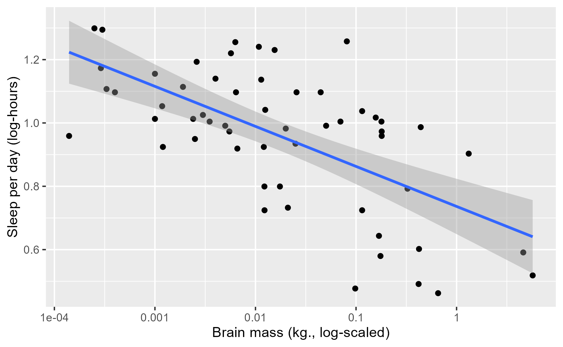
This interval conveys some uncertainty in the estimate of the mean, but this interval has a frequentist interpretation which can be unintuitive for this sort of data.
Now, for the point of this post: What’s the Bayesian version of this kind of visualization? Specifically, we want to illustrate:
- Predictions from a regression model
- Some uncertainty about those predictions
- Raw data used to train the model
Option 1: The pile-of-lines plot
The regression line in the classical plot is just one particular line. It’s the line of best fit that satisfies a least-squares or maximum-likelihood objective. Our Bayesian model estimates an entire distribution of plausible regression lines. The first way to visualize our uncertainty is to plot our own line of best fit along with a sample of other lines from the posterior distribution of the model.
First, we fit a model RStanARM using weakly informative priors.
library("rstanarm")

m1 <- stan_glm(
  log_sleep_total ~ log_brainwt,
  family = gaussian(),
  data = msleep,
  # for reproducibility
  seed = 20161118,
  prior = normal(0, 3),
  prior_intercept = normal(0, 3)
)
We now have 4,000 credible regressions lines for our data.
summary(m1)
#>
#> Model Info:
#>  function:     stan_glm
#>  family:       gaussian [identity]
#>  formula:      log_sleep_total ~ log_brainwt
#>  algorithm:    sampling
#>  sample:       4000 (posterior sample size)
#>  priors:       see help('prior_summary')
#>  observations: 56
#>  predictors:   2
#>
#> Estimates:
#>               mean   sd   10%   50%   90%
#> (Intercept)  0.7    0.0  0.7   0.7   0.8
#> log_brainwt -0.1    0.0 -0.2  -0.1  -0.1
#> sigma        0.2    0.0  0.2   0.2   0.2
#>
#> Fit Diagnostics:
#>            mean   sd   10%   50%   90%
#> mean_PPD 1.0    0.0  0.9   1.0   1.0
#>
#> The mean_ppd is the sample average posterior predictive distribution of the outcome variable (for details see help('summary.stanreg')).
#>
#> MCMC diagnostics
#>               mcse Rhat n_eff
#> (Intercept)   0.0  1.0  3683
#> log_brainwt   0.0  1.0  3808
#> sigma         0.0  1.0  2949
#> mean_PPD      0.0  1.0  3714
#> log-posterior 0.0  1.0  1646
#>
#> For each parameter, mcse is Monte Carlo standard error, n_eff is a crude measure of effective sample size, and Rhat is the potential scale reduction factor on split chains (at convergence Rhat=1).
For models fit by RStanARM, the generic coefficient function coef() returns
the median parameter values.
coef(m1)
#> (Intercept) log_brainwt
#>   0.7369320  -0.1264927
coef(m1_classical)
#> (Intercept) log_brainwt
#>   0.7363492  -0.1264049
We can see that the intercept and slope of the median line is pretty close to the classical model’s intercept and slope. The median line serves as the “point estimate” for our model: If we had to summarize the modeled relationship using just a single number for each parameter, we can use the medians.
One way to visualize our model therefore is to plot our point-estimate line plus a sample of the other credible lines from our model. First, we create a data-frame with all 4,000 regression lines.
# Coercing a model to a data-frame returns data-frame of posterior samples.
# One row per sample.
fits <- m1 %>%
  as_tibble() %>%
  rename(intercept = `(Intercept)`) %>%
  select(-sigma)
fits
#> # A tibble: 4,000 × 2
#>    intercept log_brainwt
#>        <dbl>       <dbl>
#>  1     0.743     -0.136
#>  2     0.728     -0.118
#>  3     0.723     -0.136
#>  4     0.801     -0.104
#>  5     0.826     -0.0719
#>  6     0.822     -0.0603
#>  7     0.757     -0.103
#>  8     0.760     -0.117
#>  9     0.730     -0.123
#> 10     0.719     -0.146
#> # … with 3,990 more rows
We now plot the 500 randomly sampled lines from our model with light, semi-transparent lines.
# aesthetic controllers
n_draws <- 500
alpha_level <- .15
col_draw <- "grey60"
col_median <-  "#3366FF"

ggplot(msleep) +
  aes(x = log_brainwt, y = log_sleep_total) +
  # Plot a random sample of rows as gray semi-transparent lines
  geom_abline(
    aes(intercept = intercept, slope = log_brainwt),
    data = slice_sample(fits, n = n_draws),
    color = col_draw,
    alpha = alpha_level
  ) +
  # Plot the median values in blue
  geom_abline(
    intercept = median(fits$intercept),
    slope = median(fits$log_brainwt),
    size = 1,
    color = col_median
  ) +
  geom_point() +
  scale_x_continuous(labels = function(x) 10 ^ x) +
  labs(x = lab_lines$brain_log, y = lab_lines$sleep_log)
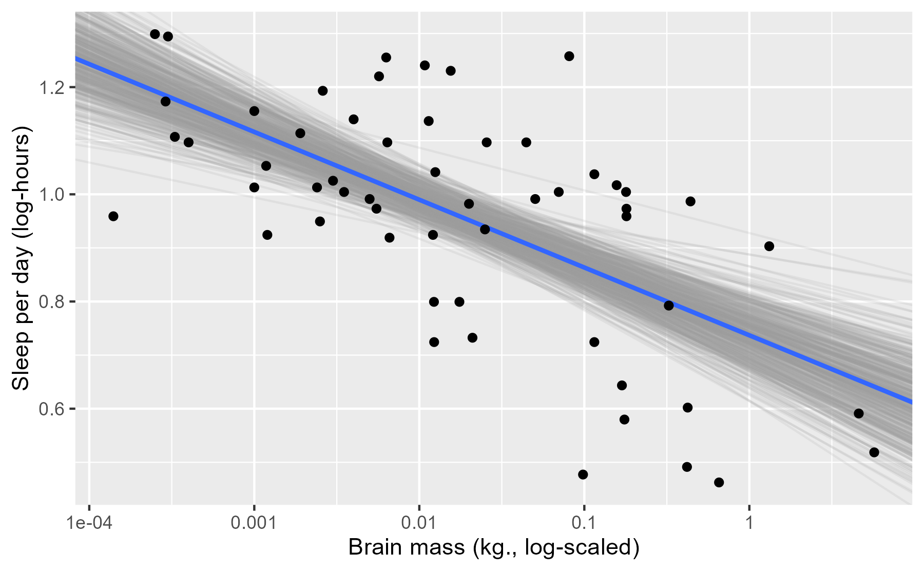
Each of these light lines represents a credible prediction of the mean across the values of x. As these line pile up on top of each other, they create an uncertainty band around our line of best fit. More plausible lines are more likely to be sampled, so these lines overlap and create a uniform color around the median line. As we move left or right, getting farther away from the mean of x, the lines start to fan out and we see very faint individual lines for some of the more extreme (yet still plausible) lines.
The advantage of this plot is that it is a direct visualization of posterior samples—one line per sample. It provides an estimate for the central tendency in the data but it also conveys uncertainty around that estimate.
This approach has limitations, however. Lines for subgroups require a little more effort to undo interactions. Also, the regression lines span the whole x axis which is not appropriate when subgroups only use a portion of the x-axis. (This limitation is solvable though.) Finally, I haven’t found good defaults for the aesthetic options: The number of samples, the colors to use, and the transparency level. One can lose lots and lots and lots of time fiddling with those knobs!
Option 2: Mean and its 95% interval
Another option is a direct port of the stat_smooth() plot: Draw a line of
best fit and the 95% uncertainty interval around it.
To limit the amount of the x axis used by the lines, we’re going to create a sequence of 80 points along the range of the data.
x_rng <- range(msleep$log_brainwt)
x_steps <- seq(x_rng[1], x_rng[2], length.out = 80)
new_data <- tibble(
  observation = seq_along(x_steps),
  log_brainwt = x_steps
)
new_data
#> # A tibble: 80 × 2
#>    observation log_brainwt
#>          <int>       <dbl>
#>  1           1       -3.85
#>  2           2       -3.80
#>  3           3       -3.74
#>  4           4       -3.68
#>  5           5       -3.62
#>  6           6       -3.56
#>  7           7       -3.50
#>  8           8       -3.45
#>  9           9       -3.39
#> 10          10       -3.33
#> # … with 70 more rows
The function posterior_linpred() returns the model-fitted means for a data-frame
of new data. I say means because the function computes 80 predicted means for
each sample from the posterior. The result is 4000 x 80 matrix of fitted means.
pred_lin <- posterior_linpred(m1, newdata = new_data)
dim(pred_lin)
#> [1] 4000   80
We are going to reduce this down to just a median and 95% interval around each
point. I do some tidying to get the data into a long format (one row per fitted
mean per posterior sample), and then do a table-join with the observation
column included in new_data. I store these steps in a function because I
have to do them again later in this post.
tidy_predictions <- function(
  mat_pred,
  df_data,
  obs_name = "observation",
  prob_lwr = .025,
  prob_upr = .975
) {
  # Get dataframe with one row per fitted value per posterior sample
  df_pred <- mat_pred %>%
    as_tibble() %>%
    setNames(seq_len(ncol(.))) %>%
    tibble::rownames_to_column("posterior_sample") %>%
    tidyr::pivot_longer(
      cols = c(-posterior_sample),
      names_to = obs_name,
      values_to = "fitted"
    )

  # Helps with joining later
  class(df_pred[[obs_name]]) <- class(df_data[[obs_name]])

  # Summarise prediction interval for each observation
  df_pred %>%
    group_by(.data[[obs_name]]) %>%
    summarise(
      median = median(fitted),
      lower = quantile(fitted, prob_lwr),
      upper = quantile(fitted, prob_upr)
    ) %>%
    left_join(df_data, by = obs_name)
}

df_pred_lin <- tidy_predictions(pred_lin, new_data)
df_pred_lin
#> # A tibble: 80 × 5
#>    observation median lower upper log_brainwt
#>          <int>  <dbl> <dbl> <dbl>       <dbl>
#>  1           1   1.22  1.12  1.32       -3.85
#>  2           2   1.22  1.11  1.31       -3.80
#>  3           3   1.21  1.11  1.30       -3.74
#>  4           4   1.20  1.10  1.29       -3.68
#>  5           5   1.19  1.10  1.29       -3.62
#>  6           6   1.19  1.09  1.28       -3.56
#>  7           7   1.18  1.09  1.27       -3.50
#>  8           8   1.17  1.08  1.26       -3.45
#>  9           9   1.17  1.08  1.25       -3.39
#> 10          10   1.16  1.07  1.24       -3.33
#> # … with 70 more rows
We can do the line-plus-interval plot using geom_ribbon() for the uncertainty
band.
p_linpread <- ggplot(msleep) +
  aes(x = log_brainwt) +
  geom_ribbon(
    aes(ymin = lower, ymax = upper),
    data = df_pred_lin,
    alpha = 0.4,
    fill = "grey60"
  ) +
  geom_line(
    aes(y = median),
    data = df_pred_lin,
    colour = "#3366FF",
    size = 1
  ) +
  geom_point(aes(y = log_sleep_total)) +
  scale_x_continuous(labels = function(x) 10 ^ x) +
  labs(x = lab_lines$brain_log, y = lab_lines$sleep_log)
p_linpread
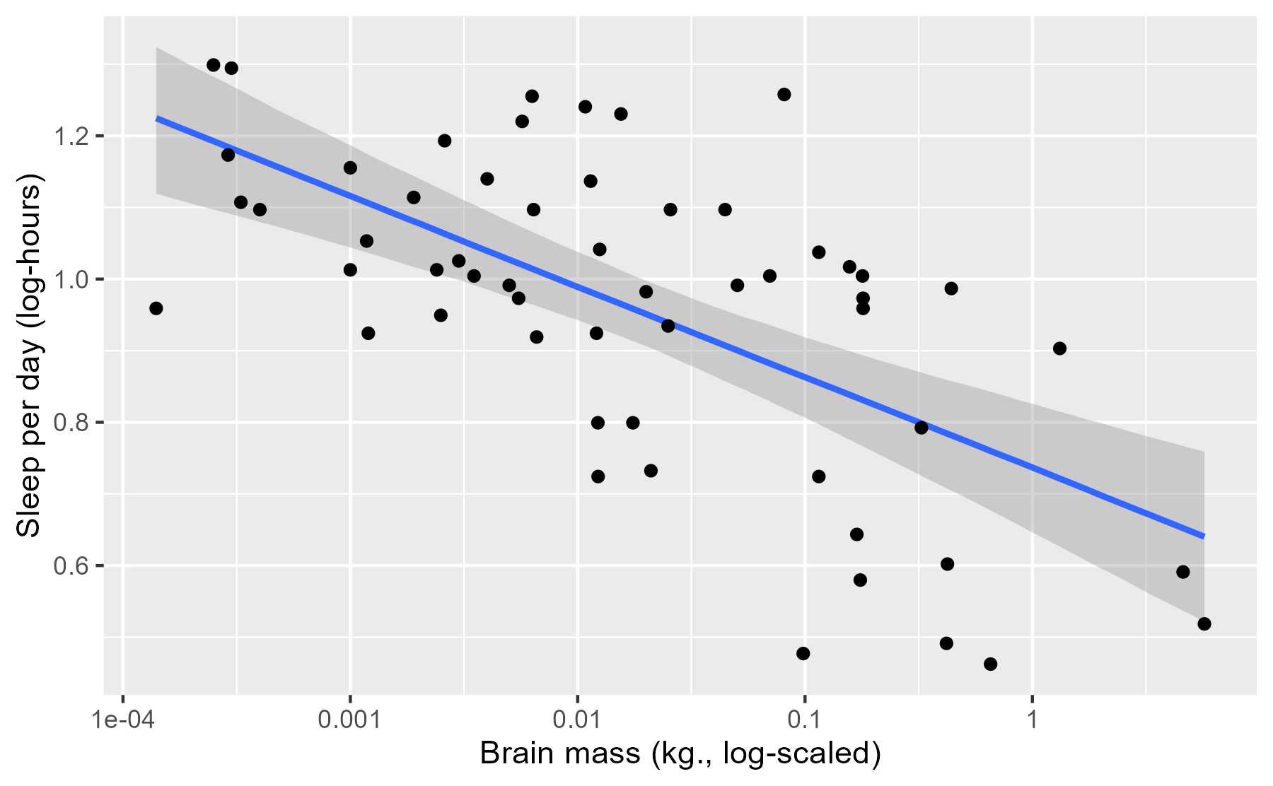
This plot is just like the stat_smooth() plot, except the interval here is
interpreted in terms of post-data probabilities: We’re 95% certain—given the
data, model and our prior information—that the “true” average sleep duration
is contained in this interval. I put “true” in quotes because this is truth in
the “small world” of the model, to quote
Statistical Rethinking, not
necessarily the real world.
Although the interpretation of the interval changes (compared to a classical
confidence interval), its location barely changes at all. If we overlay a
stat_smooth() layer onto this plot, we can see that two sets of intervals are
virtually identical. With this much data and for this simple of a model, both
types of models can make very similar estimates.
p_linpread +
  stat_smooth(aes(y = log_sleep_total), method = "lm")
#> `geom_smooth()` using formula 'y ~ x'
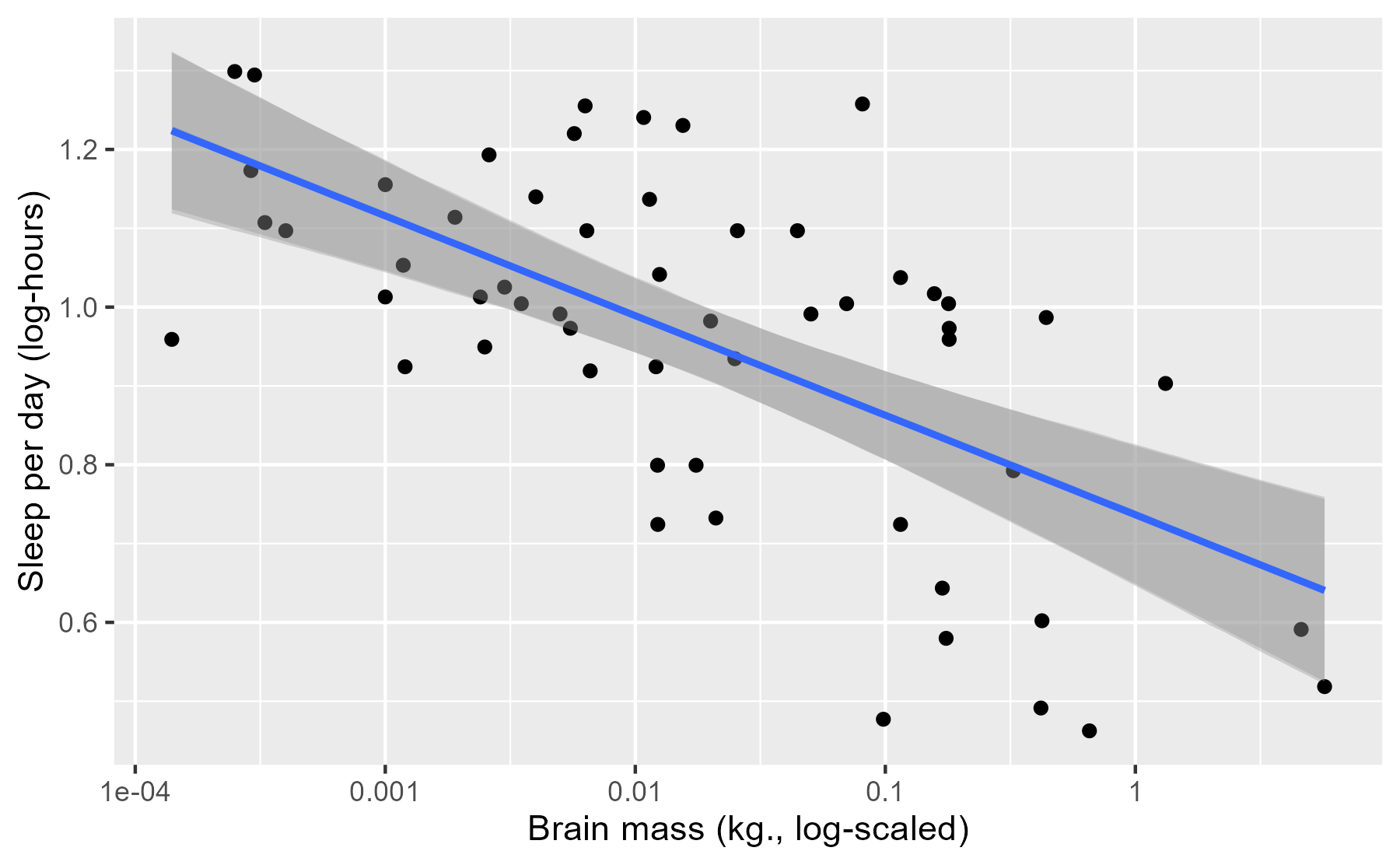
The previous plot illustrates one limitation of this approach: Pragmatically
speaking, stat_smooth() basically does the same thing, and we’re
not taking advantage of the affordances provided by our model. This is why
RStanARM, in a kind of amusing way, disowns posterior_linpred() in its
documentation:
This function is occasionally convenient, but it should be used sparingly. Inference and model checking should generally be carried out using the posterior predictive distribution (see
posterior_predict).
Occasionally convenient. 😮 And elsewhere:
See also:
posterior_predictto draw from the posterior predictive distribution of the outcome, which is almost always preferable.
Option 3: Mean and 95% interval for model-generated data
The reason why posterior_predict() is preferable is that it uses more
information from our model, namely the error term sigma.
poseterior_linpred() predicts averages; posterior_predict() predicts new
observations. This posterior predictive checking helps us confirm whether our
model—a story of how the data could have been generated—can produce new data
that resembles our data.
Here, we can use the function we defined earlier to get prediction intervals.
# Still a matrix with one row per posterior draw and one column per observation
pred_post <- posterior_predict(m1, newdata = new_data)
dim(pred_post)
#> [1] 4000   80

df_pred_post <- tidy_predictions(pred_post, new_data)
df_pred_post
#> # A tibble: 80 × 5
#>    observation median lower upper log_brainwt
#>          <int>  <dbl> <dbl> <dbl>       <dbl>
#>  1           1   1.22 0.868  1.59       -3.85
#>  2           2   1.22 0.868  1.57       -3.80
#>  3           3   1.21 0.849  1.56       -3.74
#>  4           4   1.21 0.854  1.56       -3.68
#>  5           5   1.21 0.840  1.55       -3.62
#>  6           6   1.19 0.830  1.55       -3.56
#>  7           7   1.18 0.827  1.54       -3.50
#>  8           8   1.17 0.816  1.52       -3.45
#>  9           9   1.16 0.816  1.52       -3.39
#> 10          10   1.16 0.793  1.53       -3.33
#> # … with 70 more rows
And we can plot the interval in the same way.
ggplot(msleep) +
  aes(x = log_brainwt) +
  geom_ribbon(
    aes(ymin = lower, ymax = upper),
    data = df_pred_post,
    alpha = 0.4,
    fill = "grey60"
  ) +
  geom_line(
    aes(y = median),
    data = df_pred_post,
    colour = "#3366FF",
    size = 1
  ) +
  geom_point(aes(y = log_sleep_total)) +
  scale_x_continuous(labels = function(x) 10 ^ x) +
  labs(x = lab_lines$brain_log, y = lab_lines$sleep_log)
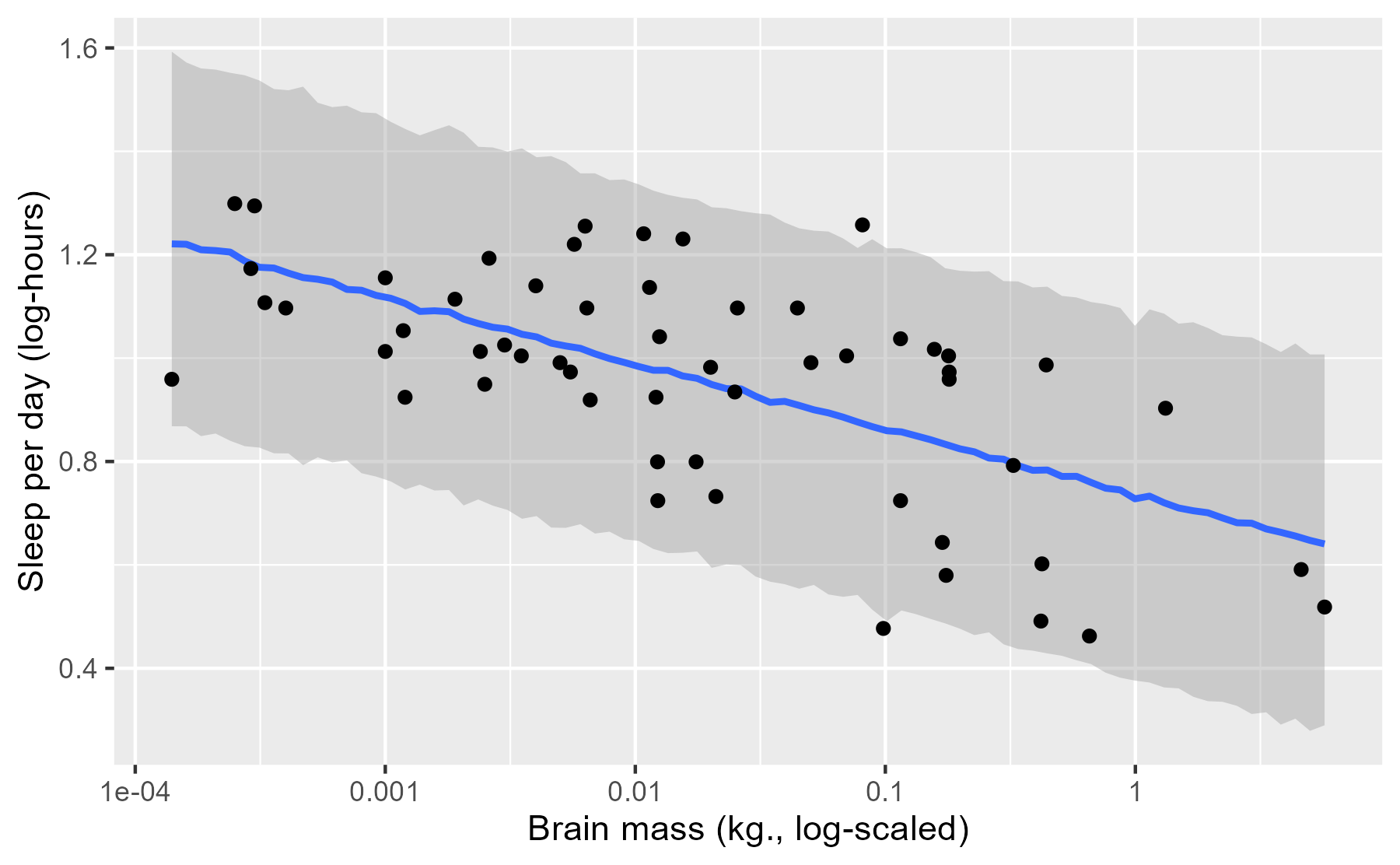
First, we can appreciate that this interval is much wider. That’s because the interval doesn’t summarize a particular statistic (like an average) but all of the observations that can generated by our model. Okay, not all of the observations—just the 95% most probable observations.
Next, we can also appreciate that the line and the ribbon are jagged due to simulation randomness. Each prediction is a random number draw, and at each value of x, we have 4000 such random draws. We computed a median and 95% interval at each x, but due to randomness from simulating new data, these medians do not smoothly connect together in the plot. That’s okay, because these fluctuations are relatively small.
Finally, we can see that there are only two points outside of the interval. These appear to be the restless roe deer and the ever-sleepy giant armadillo. These two represent the main outliers for our model because they fall slight outside of the 95% prediction interval. In this way, the posterior predictive interval can help us discover which data points are relative outliers for our model.
(Maybe outliers isn’t the right word. It makes perfect sense that 2/56 = 3.6% of the observations fall outside of the 95% interval.)
This posterior prediction plot does reveal a shortcoming of our model, when plotted in a different manner.
last_plot() +
  geom_hline(yintercept = log10(24), color = "grey50") +
  geom_label(x = 0, y = log10(24), label = "24 hours")
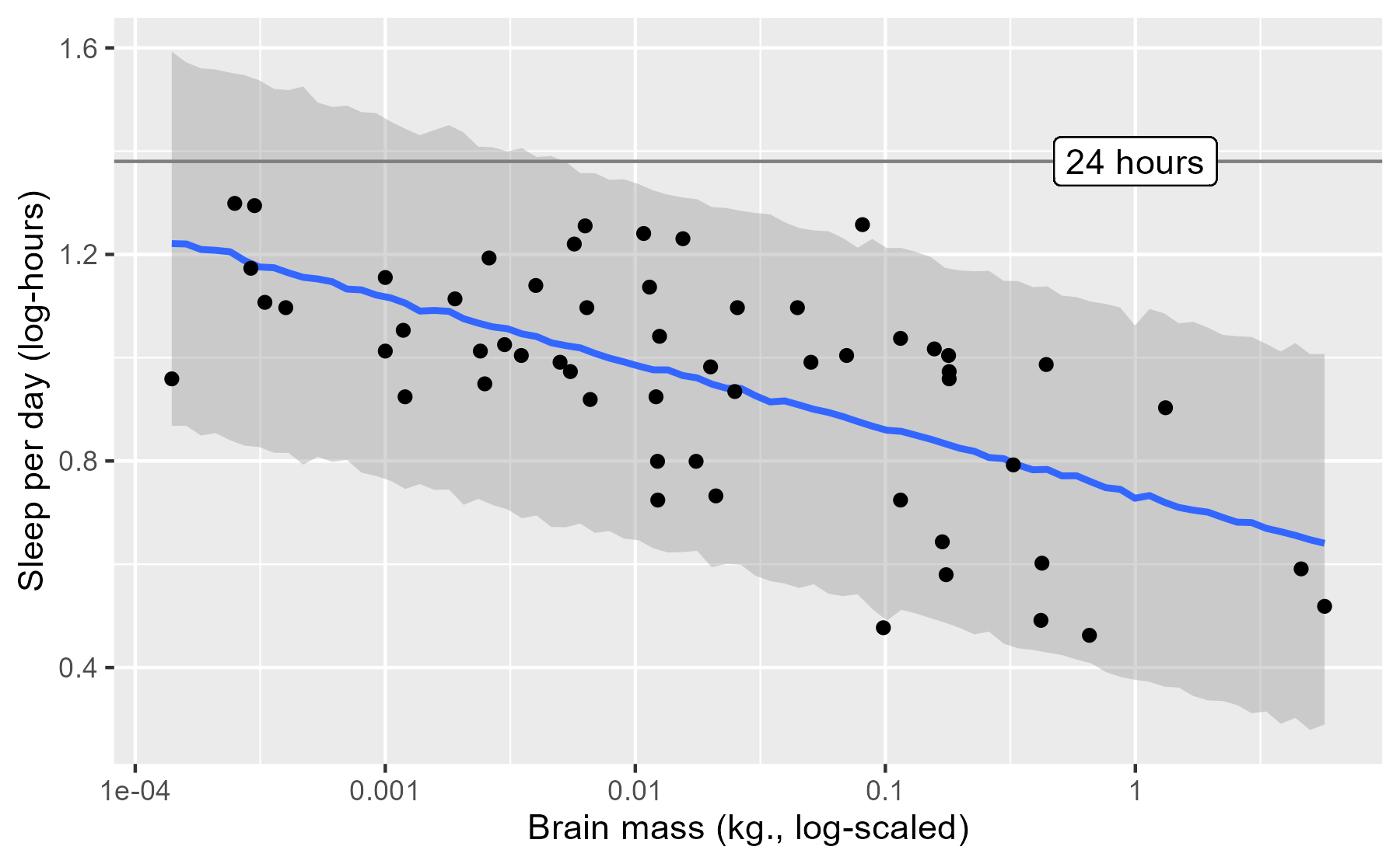
One faulty consequence of how our model was specified is that it predicts that some mammals sleep more than 24 hours per day—oh, what a life to live 😴.
Wrap up
In the post, I covered three different ways to plot the results of an RStanARM model, while demonstrating some of the key functions for working with RStanARM models. Time well spent, I think.
As for future directions, I learned about the under-development (as of November 2016) R package bayesplot by the Stan team. The README package shows off a lot of different ways to visualize posterior samples from a model. I’ll be sure to demo it on this data-set once it goes live.
Last knitted on 2022-05-27. Source code on GitHub.2
-
That is, if we map the plot’s color aesthetic to a categorical variable in the data,
stat_smooth()will fit a separate model for each color/category. I figured this out when I tried to write my own functionstat_smooth_stan()based on ggplot2’s extensions vignette and noticed that RStanARM was printing out MCMC sampling information for each color/category of the data. ↩ -
.session_info
#> ─ Session info ───────────────────────────────────────────────────────────────
#>  setting      value
#>  version      R version 4.2.0 (2022-04-22 ucrt)
#>  os           Windows 10 x64 (build 22000)
#>  system       x86_64, mingw32
#>  ui           RTerm
#>  language     (EN)
#>  collate      English_United States.utf8
#>  ctype        English_United States.utf8
#>  tz           America/Chicago
#>  date         2022-05-27
#>  pandoc       NA
#>  stan (rstan) 2.21.0
#>
#> ─ Packages ───────────────────────────────────────────────────────────────────
#>  ! package      * version  date (UTC) lib source
#>    abind          1.4-5    2016-07-21 [1] CRAN (R 4.2.0)
#>    arm            1.12-2   2021-10-15 [1] CRAN (R 4.2.0)
#>    assertthat     0.2.1    2019-03-21 [1] CRAN (R 4.2.0)
#>    base64enc      0.1-3    2015-07-28 [1] CRAN (R 4.2.0)
#>    bayesplot      1.9.0    2022-03-10 [1] CRAN (R 4.2.0)
#>    boot           1.3-28   2021-05-03 [2] CRAN (R 4.2.0)
#>    callr          3.7.0    2021-04-20 [1] CRAN (R 4.2.0)
#>    cli            3.3.0    2022-04-25 [1] CRAN (R 4.2.0)
#>    coda           0.19-4   2020-09-30 [1] CRAN (R 4.2.0)
#>    codetools      0.2-18   2020-11-04 [2] CRAN (R 4.2.0)
#>    colorspace     2.0-3    2022-02-21 [1] CRAN (R 4.2.0)
#>    colourpicker   1.1.1    2021-10-04 [1] CRAN (R 4.2.0)
#>    crayon         1.5.1    2022-03-26 [1] CRAN (R 4.2.0)
#>    crosstalk      1.2.0    2021-11-04 [1] CRAN (R 4.2.0)
#>    DBI            1.1.2    2021-12-20 [1] CRAN (R 4.2.0)
#>    digest         0.6.29   2021-12-01 [1] CRAN (R 4.2.0)
#>    dplyr        * 1.0.9    2022-04-28 [1] CRAN (R 4.2.0)
#>    DT             0.23     2022-05-10 [1] CRAN (R 4.2.0)
#>    dygraphs       1.1.1.6  2018-07-11 [1] CRAN (R 4.2.0)
#>    ellipsis       0.3.2    2021-04-29 [1] CRAN (R 4.2.0)
#>    evaluate       0.15     2022-02-18 [1] CRAN (R 4.2.0)
#>    fansi          1.0.3    2022-03-24 [1] CRAN (R 4.2.0)
#>    farver         2.1.0    2021-02-28 [1] CRAN (R 4.2.0)
#>    fastmap        1.1.0    2021-01-25 [1] CRAN (R 4.2.0)
#>    generics       0.1.2    2022-01-31 [1] CRAN (R 4.2.0)
#>    ggplot2      * 3.3.6    2022-05-03 [1] CRAN (R 4.2.0)
#>    ggrepel        0.9.1    2021-01-15 [1] CRAN (R 4.2.0)
#>    ggridges       0.5.3    2021-01-08 [1] CRAN (R 4.2.0)
#>    git2r          0.30.1   2022-03-16 [1] CRAN (R 4.2.0)
#>    glue           1.6.2    2022-02-24 [1] CRAN (R 4.2.0)
#>    gridExtra      2.3      2017-09-09 [1] CRAN (R 4.2.0)
#>    gtable         0.3.0    2019-03-25 [1] CRAN (R 4.2.0)
#>    gtools         3.9.2.1  2022-05-23 [1] CRAN (R 4.2.0)
#>    here           1.0.1    2020-12-13 [1] CRAN (R 4.2.0)
#>    highr          0.9      2021-04-16 [1] CRAN (R 4.2.0)
#>    htmltools      0.5.2    2021-08-25 [1] CRAN (R 4.2.0)
#>    htmlwidgets    1.5.4    2021-09-08 [1] CRAN (R 4.2.0)
#>    httpuv         1.6.5    2022-01-05 [1] CRAN (R 4.2.0)
#>    igraph         1.3.1    2022-04-20 [1] CRAN (R 4.2.0)
#>    inline         0.3.19   2021-05-31 [1] CRAN (R 4.2.0)
#>    knitr        * 1.39     2022-04-26 [1] CRAN (R 4.2.0)
#>    labeling       0.4.2    2020-10-20 [1] CRAN (R 4.2.0)
#>    later          1.3.0    2021-08-18 [1] CRAN (R 4.2.0)
#>    lattice        0.20-45  2021-09-22 [2] CRAN (R 4.2.0)
#>    lifecycle      1.0.1    2021-09-24 [1] CRAN (R 4.2.0)
#>    lme4           1.1-29   2022-04-07 [1] CRAN (R 4.2.0)
#>    loo            2.5.1    2022-03-24 [1] CRAN (R 4.2.0)
#>    magrittr       2.0.3    2022-03-30 [1] CRAN (R 4.2.0)
#>    markdown       1.1      2019-08-07 [1] CRAN (R 4.2.0)
#>    MASS           7.3-56   2022-03-23 [2] CRAN (R 4.2.0)
#>    Matrix         1.4-1    2022-03-23 [2] CRAN (R 4.2.0)
#>    matrixStats    0.62.0   2022-04-19 [1] CRAN (R 4.2.0)
#>    mgcv           1.8-40   2022-03-29 [2] CRAN (R 4.2.0)
#>    mime           0.12     2021-09-28 [1] CRAN (R 4.2.0)
#>    miniUI         0.1.1.1  2018-05-18 [1] CRAN (R 4.2.0)
#>    minqa          1.2.4    2014-10-09 [1] CRAN (R 4.2.0)
#>    munsell        0.5.0    2018-06-12 [1] CRAN (R 4.2.0)
#>    nlme           3.1-157  2022-03-25 [2] CRAN (R 4.2.0)
#>    nloptr         2.0.2    2022-05-19 [1] CRAN (R 4.2.0)
#>    pillar         1.7.0    2022-02-01 [1] CRAN (R 4.2.0)
#>    pkgbuild       1.3.1    2021-12-20 [1] CRAN (R 4.2.0)
#>    pkgconfig      2.0.3    2019-09-22 [1] CRAN (R 4.2.0)
#>    plyr           1.8.7    2022-03-24 [1] CRAN (R 4.2.0)
#>    prettyunits    1.1.1    2020-01-24 [1] CRAN (R 4.2.0)
#>    processx       3.5.3    2022-03-25 [1] CRAN (R 4.2.0)
#>    promises       1.2.0.1  2021-02-11 [1] CRAN (R 4.2.0)
#>    ps             1.7.0    2022-04-23 [1] CRAN (R 4.2.0)
#>    purrr          0.3.4    2020-04-17 [1] CRAN (R 4.2.0)
#>    R6             2.5.1    2021-08-19 [1] CRAN (R 4.2.0)
#>    ragg           1.2.2    2022-02-21 [1] CRAN (R 4.2.0)
#>    Rcpp         * 1.0.8.3  2022-03-17 [1] CRAN (R 4.2.0)
#>  D RcppParallel   5.1.5    2022-01-05 [1] CRAN (R 4.2.0)
#>    reshape2       1.4.4    2020-04-09 [1] CRAN (R 4.2.0)
#>    rlang          1.0.2    2022-03-04 [1] CRAN (R 4.2.0)
#>    rprojroot      2.0.3    2022-04-02 [1] CRAN (R 4.2.0)
#>    rstan          2.21.5   2022-04-11 [1] CRAN (R 4.2.0)
#>    rstanarm     * 2.21.3   2022-04-09 [1] CRAN (R 4.2.0)
#>    rstantools     2.2.0    2022-04-08 [1] CRAN (R 4.2.0)
#>    rstudioapi     0.13     2020-11-12 [1] CRAN (R 4.2.0)
#>    scales         1.2.0    2022-04-13 [1] CRAN (R 4.2.0)
#>    sessioninfo    1.2.2    2021-12-06 [1] CRAN (R 4.2.0)
#>    shiny          1.7.1    2021-10-02 [1] CRAN (R 4.2.0)
#>    shinyjs        2.1.0    2021-12-23 [1] CRAN (R 4.2.0)
#>    shinystan      2.6.0    2022-03-03 [1] CRAN (R 4.2.0)
#>    shinythemes    1.2.0    2021-01-25 [1] CRAN (R 4.2.0)
#>    StanHeaders    2.21.0-7 2020-12-17 [1] CRAN (R 4.2.0)
#>    stringi        1.7.6    2021-11-29 [1] CRAN (R 4.2.0)
#>    stringr        1.4.0    2019-02-10 [1] CRAN (R 4.2.0)
#>    survival       3.3-1    2022-03-03 [2] CRAN (R 4.2.0)
#>    systemfonts    1.0.4    2022-02-11 [1] CRAN (R 4.2.0)
#>    textshaping    0.3.6    2021-10-13 [1] CRAN (R 4.2.0)
#>    threejs        0.3.3    2020-01-21 [1] CRAN (R 4.2.0)
#>    tibble         3.1.7    2022-05-03 [1] CRAN (R 4.2.0)
#>    tidyr          1.2.0    2022-02-01 [1] CRAN (R 4.2.0)
#>    tidyselect     1.1.2    2022-02-21 [1] CRAN (R 4.2.0)
#>    utf8           1.2.2    2021-07-24 [1] CRAN (R 4.2.0)
#>    vctrs          0.4.1    2022-04-13 [1] CRAN (R 4.2.0)
#>    withr          2.5.0    2022-03-03 [1] CRAN (R 4.2.0)
#>    xfun           0.31     2022-05-10 [1] CRAN (R 4.2.0)
#>    xtable         1.8-4    2019-04-21 [1] CRAN (R 4.2.0)
#>    xts            0.12.1   2020-09-09 [1] CRAN (R 4.2.0)
#>    zoo            1.8-10   2022-04-15 [1] CRAN (R 4.2.0)
#>
#>  [1] C:/Users/Tristan/AppData/Local/R/win-library/4.2
#>  [2] C:/Program Files/R/R-4.2.0/library
#>
#>  D ── DLL MD5 mismatch, broken installation.
#>
#> ──────────────────────────────────────────────────────────────────────────────

Leave a comment